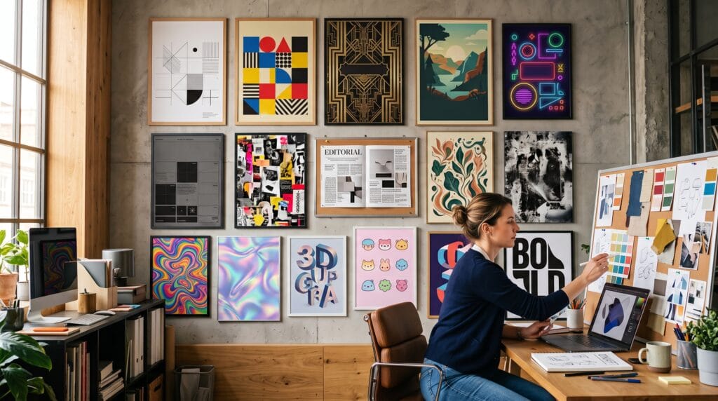
Design style is the visual language that gives a project its personality. It shapes how color, typography, imagery, spacing, texture, and composition work together. Understanding graphic design styles helps designers make intentional choices instead of selecting fonts, colors, and effects only because they look attractive.
A style can communicate trust, energy, nostalgia, luxury, playfulness, rebellion, precision, or innovation before the audience reads a single word. The same product can feel completely different when presented through minimalist design, Art Deco ornament, vintage illustration, brutalist typography, or futuristic 3D visuals.
Professional designers rarely copy one historical style without adjustment. They study the defining principles, understand the audience, and adapt those principles to the brand, medium, and communication goal. A modern identity may combine Swiss grid discipline with expressive typography, while a packaging project may blend Art Deco geometry with contemporary colors.
This guide explains 18 influential graphic design styles using practical examples. You will learn their defining features, common applications, typography and color choices, strengths, limitations, and the situations in which each style works best.
What Are Graphic Design Styles?
Graphic design styles are recognizable visual approaches built from recurring design choices.
A style may be defined by:
- Layout structure
- Typography
- Color palette
- Shape language
- Image treatment
- Illustration technique
- Texture
- Ornament
- Historical influence
- Cultural context
- Production method
Styles help audiences interpret a message quickly. Clean spacing and neutral colors may suggest professionalism, while irregular collage and distressed type may suggest experimentation or rebellion.
Why Graphic Design Styles Matter
A clear style creates consistency across:
- Logos
- Websites
- Packaging
- Advertising
- Social media
- Publications
- Presentations
- Signage
- Merchandise
Strong graphic design styles support three important goals:
- Recognition: Repeated visual choices make a brand easier to remember.
- Meaning: Style communicates mood, values, and positioning.
- Usability: Appropriate layout and typography improve understanding.
Style should support communication rather than compete with it.
1. Minimalist Graphic Design Style
Minimalism removes unnecessary elements and focuses on essential content.
Defining Features
- Generous white space
- Limited color palette
- Simple typography
- Clean alignment
- Few decorative elements
- Strong visual hierarchy
Real Example
Imagine a premium skincare package with a cream background, one elegant wordmark, a small ingredient line, and a single muted accent color. The quiet composition makes the product feel refined and trustworthy.
Best Uses
- Luxury branding
- Technology websites
- Professional portfolios
- Architecture
- Beauty products
- Editorial covers
Common Mistake
Minimalism is not simply leaving a design empty. Weak hierarchy or insufficient contrast can make a layout feel unfinished.
Also Read: Minimalist Graphic Design Inspiration for Modern Brands
2. Swiss or International Typographic Style
Swiss design became influential through its disciplined grids, objective typography, and clear information structure.
Defining Features
- Mathematical grids
- Sans serif type
- Asymmetrical layouts
- Strong alignment
- Photography rather than decoration
- Functional hierarchy
Real Example
A museum poster may use a large left-aligned date, a black-and-white photograph, a red accent, and a strict column grid. Every element serves an informational purpose.
Best Uses
- Cultural posters
- Corporate reports
- Wayfinding
- Editorial systems
- Information design
- Digital interfaces
Typography Tip
Neutral sans serif families work well because they support clarity without dominating the message.
3. Bauhaus Graphic Design Style
Bauhaus design combines art, craft, geometry, and function.
Defining Features
- Primary colors
- Circles, squares, and triangles
- Functional layouts
- Experimental typography
- Strong geometry
- Minimal ornament
Real Example
A furniture exhibition poster may use red circles, black bars, a yellow square, and condensed type arranged in an energetic geometric composition.
Best Uses
- Architecture branding
- Cultural events
- Educational design
- Posters
- Furniture brands
- Creative institutions
Common Mistake
Using random primary-colored shapes without a structural concept creates imitation rather than meaningful Bauhaus-inspired design.
4. Art Deco Graphic Design Style
Art Deco communicates glamour, modernity, and luxury through geometry and ornament.
Defining Features
- Symmetrical compositions
- Metallic colors
- Geometric borders
- Tall display typography
- Sunburst motifs
- Repeated patterns
Real Example
A luxury hotel invitation may combine black, gold, and emerald with stepped borders, fan-shaped patterns, and tall uppercase lettering.
Best Uses
- Hospitality
- Premium packaging
- Event invitations
- Fashion
- Cosmetics
- Entertainment branding
Color Direction
Black, gold, cream, deep green, burgundy, and navy create a classic Art Deco atmosphere.
5. Retro Graphic Design Style
Retro design recreates the visual character of a past decade, often from the 1950s through the 1990s.
Defining Features
- Era-specific typography
- Limited vintage palettes
- Halftones
- Grain
- Bold shapes
- Nostalgic imagery
Real Example
An eighties-inspired music poster may use neon magenta, cyan grids, chrome text, and a glowing sunset. A seventies version might use orange, brown, cream, and rounded lettering.
Best Uses
- Music
- Fashion
- Food brands
- Events
- Entertainment
- Social campaigns
Common Mistake
Mixing visual references from several decades without intention can produce an inconsistent result.
Also Read: Retro Graphic Design Styles Guide for Better Visual Results
6. Vintage Graphic Design Style
Vintage design often imitates older printing methods, packaging, signage, and illustration.
Defining Features
- Distressed texture
- Engraved illustration
- Muted colors
- Decorative borders
- Badge layouts
- Handcrafted typography
Real Example
A coffee label may use an engraved mountain illustration, arched lettering, cream paper, and faded brown ink to suggest heritage and craftsmanship.
Best Uses
- Restaurants
- Coffee brands
- Craft products
- Barbershops
- Outdoor brands
- Local businesses
Retro vs. Vintage
Retro often reinterprets a recognizable recent decade. Vintage usually aims to look like an authentic older artifact.
7. Brutalist Graphic Design Style
Brutalism rejects polished visual conventions and often makes structure feel intentionally raw.
Defining Features
- Stark contrast
- Oversized typography
- Exposed grids
- Unusual spacing
- Basic colors
- Deliberately awkward composition
Real Example
An experimental fashion website may use black text on white, visible borders, large default-style buttons, and unexpected image placement.
Best Uses
- Creative portfolios
- Fashion
- Art events
- Independent publications
- Experimental websites
- Youth campaigns
Common Mistake
Poor usability is not automatically brutalism. The style can feel raw while remaining readable and navigable.
8. Maximalist Graphic Design Style
Maximalism uses abundance, layering, pattern, color, and visual energy.
Defining Features
- Multiple colors
- Dense composition
- Decorative typography
- Pattern mixing
- Layered imagery
- Rich detail
Real Example
A music festival campaign may combine illustrated characters, bright gradients, oversized type, stickers, stars, and textures across posters and social media.
Best Uses
- Festivals
- Fashion
- Music
- Youth brands
- Entertainment
- Social content
Common Mistake
Maximalism still needs hierarchy. Without a focal point, visual abundance becomes confusion.
9. Editorial Graphic Design Style
Editorial design organizes long-form content through grids, typography, photography, and pacing.
Defining Features
- Strong typographic hierarchy
- Columns
- Captions
- Pull quotes
- Full-bleed imagery
- Repeated page systems
Real Example
A fashion magazine spread may use a full-page photograph opposite a narrow text column, an oversized serif headline, and small captions aligned to a grid.
Best Uses
- Magazines
- Reports
- Catalogs
- Lookbooks
- Blogs
- Brand publications
Digital Adaptation
Editorial principles also work in websites through modular grids, large headlines, and structured article layouts.
10. Corporate Graphic Design Style
Corporate design prioritizes consistency, credibility, clarity, and scalability.
Defining Features
- Controlled brand palette
- Professional typography
- Clear templates
- Consistent icons
- Structured photography
- Repeatable layouts
Real Example
A financial company may use navy and blue, clean charts, professional portrait photography, and a consistent presentation system.
Best Uses
- Finance
- Consulting
- Healthcare
- Technology
- B2B services
- Internal communications
Common Mistake
Corporate design can become generic when every brand uses the same stock photos, colors, and layouts.
11. Geometric Graphic Design Style
Geometric design builds visual systems from precise shapes and mathematical relationships.
Defining Features
- Circles
- Polygons
- Grids
- Repeated forms
- Symmetry
- Angular patterns
Real Example
A technology startup identity may use a modular hexagon symbol that expands into website backgrounds, presentation graphics, and motion patterns.
Best Uses
- Technology
- Architecture
- Finance
- Science
- Data products
- Modern branding
Practical Tip
Use one consistent geometric logic rather than combining unrelated shapes.
12. Organic Graphic Design Style
Organic design draws from nature, handmade forms, irregular lines, and soft movement.
Defining Features
- Curved shapes
- Earth-inspired colors
- Botanical imagery
- Natural textures
- Hand-drawn illustration
- Irregular composition
Real Example
A wellness brand may use sage green, warm beige, watercolor leaves, soft serif typography, and rounded packaging labels.
Best Uses
- Wellness
- Sustainability
- Food
- Natural cosmetics
- Lifestyle brands
- Hospitality
Common Mistake
Nature-inspired design should still be distinctive. Generic leaves and beige palettes can make many brands look identical.
13. Grunge Graphic Design Style
Grunge design uses rough textures, distressed typography, and imperfect composition.
Defining Features
- Scratches
- Torn-paper effects
- Photocopy texture
- Distressed type
- Dark palettes
- Layered collage
Real Example
An alternative rock poster may use black-and-white photography, red paint marks, torn edges, and uneven condensed lettering.
Best Uses
- Music
- Streetwear
- Sports
- Youth culture
- Posters
- Independent publishing
Readability Rule
Apply texture selectively. Important text still needs sufficient contrast.
14. Psychedelic Graphic Design Style
Psychedelic design uses intense color, fluid forms, optical movement, and expressive typography.
Defining Features
- Highly saturated colors
- Warped lettering
- Repeated patterns
- Surreal imagery
- Curved forms
- Optical effects
Real Example
A concert poster may use flowing illustrated shapes, rainbow gradients, distorted lettering, and dreamlike characters.
Best Uses
- Music
- Festivals
- Creative events
- Fashion
- Entertainment
- Experimental campaigns
Common Mistake
Too much distortion can make essential information unreadable.
15. Futuristic Graphic Design Style
Futuristic design imagines advanced technology, digital systems, space, or speculative environments.
Defining Features
- Dark backgrounds
- Neon accents
- Data-inspired graphics
- Metallic surfaces
- Holographic gradients
- Technical typography
Real Example
An AI conference identity may use a deep navy background, electric blue light trails, translucent panels, and condensed technical type.
Best Uses
- Artificial intelligence
- Gaming
- Technology
- Automotive
- Science
- Innovation events
Practical Tip
Balance futuristic effects with simple navigation and readable text.
16. Three-Dimensional Graphic Design Style
Three-dimensional design uses modeled objects, depth, lighting, and materials.
Defining Features
- Realistic or stylized depth
- Lighting
- Shadows
- Material texture
- Perspective
- Volumetric typography
Real Example
A product launch campaign may show a floating device surrounded by glass shapes, reflective surfaces, and dimensional lettering.
Best Uses
- Product advertising
- Technology
- Entertainment
- Social campaigns
- Packaging concepts
- Motion design
Common Mistake
3D effects should support the message. Unnecessary objects can make a composition feel like a software demonstration.
17. Kawaii Graphic Design Style
Kawaii design uses cuteness, friendliness, simple characters, and bright or pastel colors.
Defining Features
- Rounded forms
- Large expressive eyes
- Pastel palettes
- Friendly typography
- Simple characters
- Cheerful patterns
Real Example
A stationery brand may use smiling food characters, lavender and mint colors, bubble lettering, and sticker-like icons.
Best Uses
- Stickers
- Children’s products
- Stationery
- Snacks
- Social media
- Merchandise
Common Mistake
Too many colors and details can weaken the simplicity that makes kawaii design memorable.
18. Typographic Graphic Design Style
Typographic design makes lettering the primary visual element.
Defining Features
- Oversized headlines
- Custom lettering
- Type-based composition
- Strong contrast
- Experimental spacing
- Limited supporting imagery
Real Example
A theatre poster may use one dramatic word stretched across the page, with event details placed in a precise secondary grid.
Best Uses
- Posters
- Editorial covers
- Branding
- Campaigns
- Packaging
- Social graphics
Typography Principle
Expression should never completely replace communication. Important information must remain readable.
Graphic Design Styles Comparison Table
| Style | Primary Mood | Typical Visual Traits | Best Applications |
|---|---|---|---|
| Minimalist | Calm and refined | White space, limited color | Luxury, technology, portfolios |
| Swiss | Clear and objective | Grid, sans serif type | Posters, reports, interfaces |
| Bauhaus | Functional and creative | Geometry, primary colors | Culture, architecture, education |
| Art Deco | Glamorous and premium | Symmetry, metallic patterns | Hospitality, beauty, events |
| Retro | Nostalgic and energetic | Era-based colors and type | Music, fashion, campaigns |
| Vintage | Authentic and handcrafted | Distress, engraving, badges | Food, coffee, craft brands |
| Brutalist | Raw and rebellious | Stark type, exposed structure | Fashion, art, web design |
| Maximalist | Energetic and expressive | Layers, color, pattern | Festivals, entertainment |
| Editorial | Sophisticated and informative | Columns, hierarchy, photography | Magazines, reports, blogs |
| Corporate | Reliable and structured | Templates, controlled palette | Finance, consulting, healthcare |
| Geometric | Precise and modern | Repeated shapes, grids | Technology, architecture |
| Organic | Natural and approachable | Curves, earth tones, textures | Wellness, food, sustainability |
| Grunge | Rough and alternative | Distress, collage, dark tones | Music, streetwear, sports |
| Psychedelic | Surreal and vibrant | Warped type, optical color | Music, events, fashion |
| Futuristic | Innovative and technical | Neon, data graphics, metallics | AI, gaming, automotive |
| 3D | Immersive and polished | Depth, lighting, materials | Advertising, launches, motion |
| Kawaii | Cute and friendly | Pastels, rounded characters | Stickers, stationery, snacks |
| Typographic | Bold and communicative | Lettering-led composition | Posters, branding, editorial |
How to Choose the Right Graphic Design Style
The best style is not the most fashionable one. It is the approach that supports the project.
1. Define the Communication Goal
Ask:
- What should the audience understand?
- What action should they take?
- Which emotion should the design create?
2. Understand the Audience
Consider:
- Age
- Interests
- Cultural context
- Expectations
- Purchasing motivation
- Visual familiarity
3. Review the Medium
A complex maximalist poster may work well at a large size but fail as a mobile advertisement.
4. Study the Category
Identify common visual codes in the market, then decide whether to align with or challenge them.
5. Build a Mood Board
Collect references for:
- Typography
- Color
- Photography
- Illustration
- Layout
- Texture
6. Create Multiple Directions
Develop at least two or three distinct concepts before selecting one.
7. Test the Style
Evaluate the design for:
- Recognition
- Readability
- Relevance
- Scalability
- Accessibility
- Consistency
Combining Graphic Design Styles
Many effective projects combine styles.
Successful Combinations
- Minimalism and Art Deco
- Swiss grid and expressive typography
- Vintage illustration and modern color
- Brutalism and editorial structure
- Organic shapes and corporate clarity
- 3D imagery and minimalist layout
Combination Rule
Choose one dominant style and one supporting influence. Equal competition between several styles often creates inconsistency.
Common Mistakes When Using Graphic Design Styles
1. Copying Surface Details
A style is more than colors and fonts. Study the underlying layout, hierarchy, and historical purpose.
2. Following Trends Without Strategy
A popular style may not fit the audience or product.
3. Sacrificing Readability
Decorative effects should not block communication.
4. Mixing Too Many Styles
Limit visual directions and create clear rules.
5. Ignoring Cultural Context
Some visual symbols and historical references require careful research.
6. Designing Only for One Format
Test the style across mobile, print, social media, packaging, and presentation formats.
Practical Graphic Design Style Exercise
Choose one product, such as coffee, headphones, or skincare.
Create three versions:
- Minimalist
- Retro
- Maximalist
Keep the product information identical.
Compare:
- First impression
- Perceived price
- Audience
- Emotional tone
- Readability
- Brand personality
This exercise demonstrates how dramatically graphic design styles influence meaning.
Graphic Design Styles Checklist
Use this checklist before approving a visual direction:
- The communication goal is clear.
- The audience is defined.
- The style supports the brand position.
- Typography matches the style.
- Color choices are intentional.
- Layout hierarchy is readable.
- Images and illustration feel consistent.
- The design works at small sizes.
- Accessibility has been considered.
- The style can scale across formats.
- Historical references are researched.
- One dominant direction is obvious.
- Decorative effects support the message.
- The design does not depend on trends alone.
Also Read: 20+ Modern Graphic Design Styles Designers Use Now
Frequently Asked Questions
1. What Are the Most Popular Graphic Design Styles?
Popular styles include minimalist, Swiss, retro, vintage, brutalist, maximalist, editorial, geometric, organic, futuristic, 3D, and typographic design.
2. Can a Brand Use More Than One Style?
Yes. A brand can combine compatible influences, but it should maintain consistent rules for typography, color, imagery, and layout.
3. What Is the Difference Between Retro and Vintage Design?
Retro design usually reinterprets a recognizable recent decade. Vintage design often attempts to resemble an older authentic artifact or production method.
4. Which Graphic Design Style Is Best for a Professional Brand?
Minimalist, Swiss, corporate, editorial, and geometric styles often support professional communication. The final choice should reflect the audience and brand personality.
5. How Do Beginners Learn Graphic Design Styles?
Study professional examples, recreate layouts for practice, analyze typography and color, build mood boards, and test one project in several different styles.
6. Are Graphic Design Styles the Same as Trends?
No. Styles are broader visual languages with recurring principles. Trends are temporary techniques or aesthetics that become popular for a period.
7. How Can Designers Avoid Copying?
Analyze principles rather than reproducing exact layouts. Combine research with original strategy, content, and brand-specific decisions.
Conclusion
Understanding graphic design styles gives designers a larger visual vocabulary and a stronger decision-making process.
Minimalism can communicate clarity. Swiss design creates structure. Art Deco suggests luxury. Retro and vintage styles create nostalgia. Brutalism communicates rebellion. Maximalism creates energy. Organic design feels natural, while futuristic and 3D design suggest innovation.
No style is automatically better than another. The correct choice depends on the audience, message, medium, brand, and practical requirements.
Study the principles behind each style, test several directions, and preserve readability. When style and strategy work together, graphic design becomes more than decoration. It becomes a clear and memorable form of communication.
Also Read: “20 Graphic Design Portfolio Tips That Get You Hired“