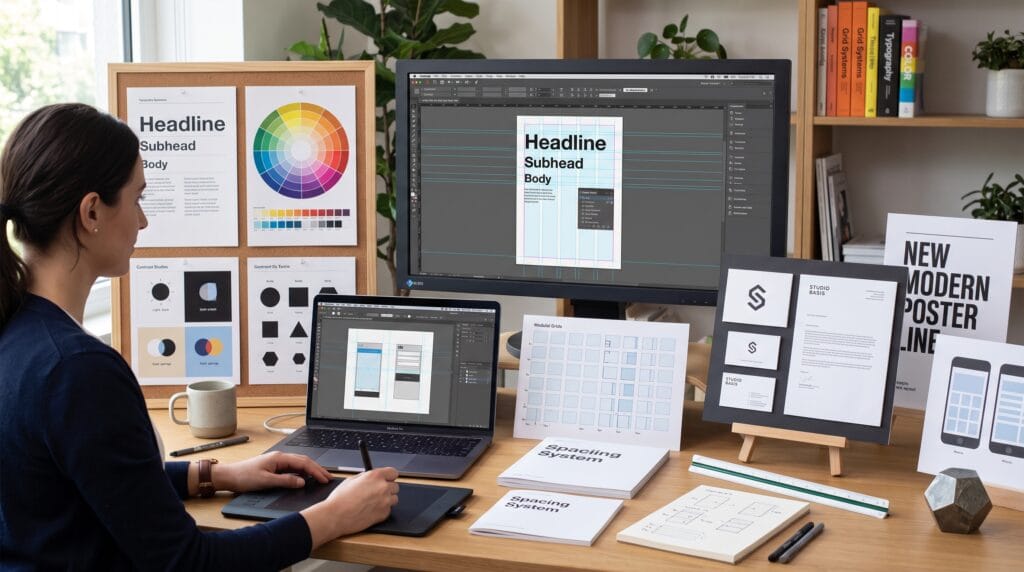
Strong creative work begins with a clear understanding of graphic design basics. Software can help you place shapes, edit images, and build layouts, but tools do not automatically create effective communication. Designers need principles that guide attention, organize information, support readability, and make visual decisions feel intentional.
These foundations matter across branding, advertising, packaging, websites, social media, presentations, editorial design, and user interfaces. A professional who understands graphic design basics can adapt to new tools and trends because the underlying logic remains useful.
This guide explains the essential principles every creative professional should learn, along with practical examples, common mistakes, workflow advice, and a checklist for reviewing finished work.
Why Graphic Design Basics Still Matter
Design trends change quickly, but the foundations of visual communication remain remarkably stable. Hierarchy, contrast, alignment, spacing, color, typography, and composition continue to shape how people understand information.
Learning these principles helps creative professionals:
- Make faster and more confident design decisions
- Create layouts that are easier to read and navigate
- Build visual consistency across multiple assets
- Communicate ideas clearly to clients and audiences
- Evaluate design quality beyond personal taste
- Adapt more easily to new software and creative formats
- Develop stronger portfolios and professional credibility
Good Design Solves a Communication Problem
Graphic design is not only decoration. It is the process of organizing words, images, color, and space to achieve a specific communication goal. A poster may need to attract attention from a distance, while a report must help readers scan complex information. The design should support the purpose.
Graphic Design Basics of Visual Hierarchy
Visual hierarchy controls the order in which people notice and understand information. Without hierarchy, every element competes for attention and the viewer may not know where to begin.
Use Size to Show Importance
Large elements usually attract attention before smaller ones. Headlines should generally be more prominent than subheadings, body copy, captions, or footnotes. The size difference must be clear enough to create an obvious reading order.
Use Weight and Color for Emphasis
Bold type, strong color, or high contrast can emphasize key information. Use these devices selectively. When everything is highlighted, nothing feels important.
Create a Clear Entry Point
Every design should have a dominant area that gives viewers a place to start. This might be a headline, image, statistic, product, or call to action. Supporting elements should lead naturally from that first point.
Also Read: Graphic Design Basics and Principles for New Designers
Balance and Composition
Composition describes how elements are arranged within a format. Strong composition makes information feel stable, intentional, and easy to explore.
Symmetrical Balance
Symmetrical layouts place similar visual weight on both sides of an axis. They often feel formal, stable, and controlled. This approach works well for luxury branding, certificates, invitations, and traditional editorial layouts.
Asymmetrical Balance
Asymmetrical layouts use different elements that still feel visually balanced. A large image on one side may be balanced by a smaller but darker text block on the other. This approach often feels more dynamic and contemporary.
Use Negative Space
Negative space is the empty area around and between elements. It improves readability, separates information, and makes important content feel more focused. Empty space is not wasted space. It is an active design tool.
Alignment Creates Order
Alignment connects elements visually. Even when items are separated, shared edges and baselines make them feel related.
Common alignment options include:
- Left alignment for easy reading and clean structure
- Centered alignment for short, formal, or decorative compositions
- Right alignment for selective emphasis or contrast
- Grid-based alignment for complex layouts
- Baseline alignment for consistent typography
Avoid placing elements almost in alignment. Small inconsistencies can make a layout feel careless even when viewers cannot explain why.
Contrast Makes Information Visible
Contrast creates difference. It helps viewers separate elements, identify priorities, and understand relationships.
Types of Contrast
| Contrast Type | Example | Purpose |
|---|---|---|
| Size | Large headline with small body text | Creates hierarchy |
| Color | Dark text on a light background | Improves visibility |
| Weight | Bold heading with regular paragraph text | Adds emphasis |
| Shape | Circular icon beside rectangular content cards | Creates distinction |
| Texture | Smooth field beside a grainy image | Adds visual interest |
| Spacing | Tight group beside a wide gap | Shows grouping and separation |
Effective contrast should be noticeable. Two elements that are only slightly different often look accidental rather than intentional.
Repetition Builds Consistency
Repetition gives a design system rhythm and identity. Reusing colors, type styles, icon treatments, borders, shapes, and spacing patterns helps separate assets feel connected.
In branding, repetition creates recognition. In editorial design, it helps readers understand recurring structures. In interfaces, it makes actions predictable.
Repeat with Purpose
Consistency does not mean making every page identical. Repeat core rules while allowing content to change. A campaign can use the same type hierarchy and color system while presenting different images and messages.
Proximity Shows Relationships
Elements placed close together are usually perceived as related. Elements separated by larger spaces feel like different groups.
Use proximity to organize:
- Headlines and supporting paragraphs
- Labels and form fields
- Product names and prices
- Images and captions
- Icons and descriptions
- Navigation items and categories
Good proximity reduces the need for extra lines, boxes, or decorative dividers.
Typography Fundamentals
Typography is one of the most important graphic design basics because most professional communication includes text. Good typography supports readability, personality, hierarchy, and tone.
Choose Typefaces for the Message
A typeface should match the audience, purpose, and context. A financial report may require restraint and authority, while a children’s product can use a friendlier and more expressive style.
Limit the Number of Typefaces
Many strong designs use one type family with multiple weights, or two complementary families. Too many unrelated fonts create visual noise and weaken consistency.
Control Line Length and Spacing
Long lines make reading difficult because the eye must travel too far. Very short lines interrupt reading rhythm. Adjust column width, font size, line spacing, and margins together.
Important typography controls include:
- Font size
- Line height or leading
- Letter spacing or tracking
- Kerning between individual letters
- Paragraph spacing
- Line length
- Alignment
- Weight and style
Also Read: Graphic Design Typography for Better Branding and Identity
Color Theory for Graphic Design Basics
Color affects attention, emotion, readability, and recognition. Designers should understand both color relationships and practical production concerns.
Understand the Color Wheel
Primary, secondary, and tertiary colors help explain how hues relate. Complementary colors sit opposite each other and create strong contrast. Analogous colors sit near each other and often create harmony.
Use a Limited Palette
A focused palette is easier to control than many competing colors. Start with a primary color, a supporting color, neutrals, and one accent. Add more only when the design system requires them.
Design for Contrast and Accessibility
Text and essential interface elements need sufficient contrast against their backgrounds. Color should not be the only way to communicate status or meaning. Add labels, icons, patterns, or shapes when necessary.
Know RGB and CMYK
RGB is used for screens and light-based displays. CMYK is used for most commercial printing. Colors may change when moving between these systems, so designers should test critical brand colors before final production.
Also Read: Graphic Design Color Guide That Makes Learning Easy
Grids and Layout Systems
Grids provide structure for arranging text and images. They make alignment easier and help multiple pages or assets feel consistent.
Common Grid Types
- Single-column grids for simple reading experiences
- Multi-column grids for editorial and web layouts
- Modular grids for dashboards, catalogs, and complex systems
- Baseline grids for consistent vertical typography
- Hierarchical grids for flexible, content-led compositions
A grid should guide the design rather than restrict every creative decision. Breaking the grid can create emphasis, but the exception works best when the underlying structure is clear.
Scale and Proportion
Scale describes the relative size of elements. Proportion describes how their dimensions relate. Both help create hierarchy, rhythm, and visual interest.
Oversized typography can create impact. Small supporting details can add sophistication. The key is to ensure that scale supports the message instead of becoming an effect without purpose.
Image Selection and Cropping
Images influence mood and meaning immediately. Select visuals based on communication value, not only appearance.
Choose Images with a Clear Role
An image may explain a product, create emotion, provide context, demonstrate scale, or attract attention. Knowing its role helps determine size, placement, cropping, and editing.
Crop Intentionally
Cropping changes emphasis. Avoid cutting through important facial features, products, or visual details. Use the crop to direct attention toward the subject and create a stronger composition.
Maintain a Consistent Image Style
A brand or campaign should define lighting, color treatment, background style, framing, and subject direction. Consistent image choices can unify assets even when the content changes.
Design for the Final Format
Professional designers think about production from the beginning. A social post, package label, mobile screen, poster, and presentation have different technical and viewing requirements.
Print Considerations
- Bleed and trim areas
- CMYK color values
- Image resolution
- Paper and finishing choices
- Minimum type sizes
- Printer specifications
- Proofing and color checks
Digital Considerations
- Responsive layout behavior
- Screen contrast and accessibility
- File size and loading speed
- Image compression
- Platform dimensions
- Touch target sizes
- Export format and transparency
Graphic Design Basics for Brand Consistency
Brand consistency means that design decisions remain recognizable across touchpoints. Logos, colors, typography, imagery, icons, and layouts should support the same identity.
A practical brand system usually defines:
- Primary and alternate logo versions
- Color values for print and digital use
- Headline and body typography
- Image and illustration direction
- Spacing and layout rules
- Social media and presentation templates
- Examples of correct and incorrect usage
Consistency builds familiarity, but flexibility keeps the system useful. A strong brand identity can adapt to different messages without losing recognition.
A Practical Design Workflow
Understanding graphic design basics becomes more useful when the principles are integrated into a repeatable process.
- Clarify the goal. Define the audience, message, format, deadline, and required action.
- Collect content. Confirm final text, images, logos, dimensions, and technical requirements.
- Build a visual direction. Create a mood board or reference set that reflects the desired tone.
- Sketch several compositions. Explore hierarchy and layout before refining details.
- Choose typography and color. Test readability, contrast, and alignment with the concept.
- Develop the layout. Use a grid, spacing system, and consistent component styles.
- Review at actual size. Check whether the design works in the conditions where it will be seen.
- Test alternatives. Compare options rather than accepting the first workable solution.
- Prepare final files. Use correct formats, naming, dimensions, and production settings.
- Archive the project. Save editable files, linked assets, fonts, exports, and notes clearly.
Essential Graphic Design Tools
Tools support the process, but they should be selected according to the task.
| Tool Category | Best For | Examples |
|---|---|---|
| Vector Design | Logos, icons, scalable illustration | Adobe Illustrator, Affinity Designer |
| Raster Editing | Photography, compositing, image effects | Adobe Photoshop, Affinity Photo |
| Layout Design | Books, reports, brochures, publications | Adobe InDesign |
| Interface Design | Websites, apps, design systems | Figma |
| Fast Content Creation | Social graphics and simple marketing assets | Canva |
| Drawing and Illustration | Digital painting and custom artwork | Procreate, Adobe Fresco |
The uploaded graphic design resources also emphasize tools such as Illustrator, InDesign, Figma, and Canva for professional typography and layout workflows.
Also Read: Free Graphic Design Tools for Beginners Who Want Pro Results
Common Graphic Design Basics Mistakes
1. Using Too Many Fonts
Too many typefaces weaken hierarchy and consistency. Start with one family or a carefully matched pair.
2. Ignoring Alignment
Elements placed without shared edges or baselines make a design feel unstructured. Use guides and grids instead of relying only on visual guessing.
3. Adding Decoration Without Purpose
Shadows, gradients, textures, borders, and effects should support the message. Remove any element that does not improve communication or identity.
4. Using Weak Contrast
Small differences in size, weight, or color may not create enough distinction. Make important relationships obvious.
5. Designing Before Understanding the Content
Layout should respond to the message. Starting with visual effects before reviewing the content often creates unnecessary revisions.
6. Forgetting the Audience
A design may be attractive to the creator but unsuitable for the intended viewer. Consider audience expectations, reading ability, cultural context, and viewing conditions.
How to Practice Graphic Design Basics
Regular, focused practice helps designers convert principles into instinct.
- Recreate a professional layout to study its structure, without presenting it as original work.
- Redesign a weak poster using clearer hierarchy and spacing.
- Build the same message in three different grid systems.
- Create a black-and-white version before adding color.
- Practice pairing one display typeface with one readable text face.
- Analyze why a successful design directs attention effectively.
- Request feedback based on specific goals rather than asking whether someone likes it.
Graphic Design Basics Checklist
- Is the communication goal clear?
- Can viewers identify the most important element immediately?
- Does the hierarchy create a logical reading order?
- Are elements aligned consistently?
- Is spacing intentional and balanced?
- Does the design use enough contrast?
- Are related elements grouped together?
- Is typography readable at the final size?
- Does the color palette support the message?
- Are images relevant and cropped well?
- Does the layout follow a useful grid?
- Is the design appropriate for the final format?
- Are print or digital exports prepared correctly?
- Does the work feel consistent with the brand?
- Can any unnecessary element be removed?
Frequently Asked Questions
1. What are the most important graphic design basics?
The most important foundations include hierarchy, balance, alignment, contrast, repetition, proximity, typography, color, spacing, grids, composition, and production awareness.
2. Do creative professionals need to learn drawing?
Drawing can improve observation and idea development, but it is not required for every design role. Visual communication, composition, typography, and problem-solving are more universally important.
3. How long does it take to learn graphic design basics?
The principles can be understood quickly, but applying them consistently requires practice. Regular project work, critique, and analysis help turn knowledge into professional judgment.
4. Which software should beginners learn first?
The best first tool depends on the work. Illustrator is useful for vectors, Photoshop for image editing, InDesign for publications, Figma for interfaces, and Canva for accessible content production.
5. How can designers know whether a layout works?
Review the design against its goal. Test hierarchy, readability, contrast, alignment, spacing, audience suitability, and performance at the final size. Feedback should focus on these criteria.
Conclusion on Graphic Design Basics
Mastering graphic design basics gives creative professionals a reliable framework for making better visual decisions. Hierarchy guides attention, grids create order, typography supports communication, color shapes emotion, and spacing helps content breathe.
These principles are valuable because they remain useful across tools, industries, and trends. By practicing them consistently and reviewing work against clear communication goals, designers can create visuals that are not only attractive but also readable, purposeful, and professional.
Also Read: “Graphic Design Principles Every Beginner Should Learn“