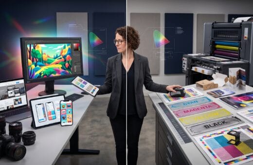
Great graphic design is much more than making something look attractive. Every successful design communicates a message, solves a problem, and guides the viewer’s attention effectively. Whether you’re creating a logo, social media graphic, website, poster, business card, or advertisement, understanding the core graphic design principles is essential for producing professional results.
Many beginners focus on software before learning design fundamentals. While tools such as Photoshop, Illustrator, or Canva are valuable, mastering the underlying graphic design principles will have a far greater impact on the quality of your work. These timeless concepts apply across print, digital media, branding, marketing, and user interface design.
This comprehensive guide introduces the most important design principles every beginner should understand and apply.
Why Graphic Design Principles Matter
Strong design principles help you:
- Improve visual communication
- Create professional-looking designs
- Build stronger brand identities
- Increase readability
- Guide viewer attention
- Improve user experience
- Deliver more effective marketing materials
Good design isn’t accidental, it’s intentional.
1. Balance
Balance refers to the visual distribution of elements within a design.
There are three common types:
Symmetrical Balance
Both sides of the design mirror each other.
Best for:
- Corporate branding
- Formal layouts
- Luxury brands
Asymmetrical Balance
Different elements create visual equilibrium without mirroring each other.
Ideal for:
- Modern websites
- Creative portfolios
- Editorial layouts
Radial Balance
Elements radiate from a central point.
Often used in:
- Logos
- Icons
- Infographics
Balanced designs feel organized and visually comfortable.
2. Contrast
Contrast helps important elements stand out.
Contrast can be created through:
- Color
- Size
- Shape
- Typography
- Texture
- Space
Examples include:
- Black text on a white background
- Large headlines with smaller body text
- Bold colors against neutral backgrounds
Strong contrast improves readability and emphasis.
3. Alignment
Every element should have a visual connection with other elements.
Good alignment creates:
- Organization
- Professional appearance
- Better readability
- Cleaner layouts
Avoid placing objects randomly without a clear structure.
4. Proximity
Related items should be grouped together.
Examples include:
- Headlines with paragraphs
- Icons with descriptions
- Product images with pricing
Grouping related information improves comprehension.
5. Visual Hierarchy
Hierarchy directs viewers toward the most important information first.
Create hierarchy using:
- Font size
- Color
- Position
- Contrast
- Spacing
- Weight
A clear hierarchy ensures viewers understand your message quickly.
6. Repetition
Repeating design elements creates consistency.
Examples include:
- Colors
- Typography
- Icons
- Button styles
- Layout patterns
Repetition strengthens brand recognition.
7. White Space
White space, also called negative space, is the empty area surrounding design elements.
Benefits include:
- Cleaner layouts
- Better readability
- Increased focus
- Premium appearance
Empty space is an important design tool, not wasted space.
8. Typography
Typography influences readability and personality.
Best practices:
- Limit font choices
- Maintain consistent spacing
- Create clear hierarchy
- Use readable font sizes
- Align text carefully
Well-chosen typography enhances every design.
9. Color Theory
Colors influence emotion and perception.
Examples include:
| Color | Common Association |
|---|---|
| Blue | Trust and professionalism |
| Green | Growth and sustainability |
| Red | Energy and urgency |
| Yellow | Optimism and creativity |
| Black | Luxury and sophistication |
| White | Simplicity and cleanliness |
Choose colors that support your brand message.
10. Consistency
Consistency helps users recognize and trust your work.
Maintain consistency across:
- Logo placement
- Typography
- Colors
- Icons
- Photography
- Layouts
Consistency strengthens visual identity.
11. Grid Systems
Grids organize content and improve alignment.
Advantages include:
- Better spacing
- Consistent layouts
- Easier responsiveness
- Improved readability
Professional designers frequently rely on grids.
12. Scale and Proportion
Different sizes create emphasis.
Use scale to highlight:
- Headlines
- Calls-to-action
- Featured products
- Important illustrations
Proper proportions improve composition.
13. Emphasis
Every design should have one primary focal point.
Emphasize elements using:
- Color
- Size
- Contrast
- Position
- Space
Too many focal points confuse viewers.
14. Unity
All design elements should work together as one cohesive composition.
Unity is achieved through:
- Consistent colors
- Similar typography
- Repeated spacing
- Harmonious imagery
Unified designs feel polished and professional.
15. Simplicity
One of the most valuable graphic design principles is simplicity.
Ask yourself:
- Is every element necessary?
- Does this improve communication?
- Can anything be removed?
Simple designs are often more memorable.
Applying Graphic Design Principles
These principles can be used across many creative projects, including:
- Logo design
- Website design
- Social media graphics
- Product packaging
- Business cards
- Posters
- Advertisements
- Presentations
- Infographics
Regardless of the medium, strong fundamentals remain the same.
Beginner Projects with Graphic Design Principles
Practice these principles by creating:
- Personal logo
- Instagram post
- Business flyer
- Event poster
- Company brochure
- Website landing page
- Product advertisement
- Brand identity mockup
Practical experience is the fastest way to improve.
Recommended Graphic Design Tools
| Tool | Purpose |
|---|---|
| Adobe Photoshop | Photo editing |
| Adobe Illustrator | Vector graphics |
| Canva | Quick graphic creation |
| Figma | UI/UX and collaborative design |
| Adobe InDesign | Print layouts |
| Procreate | Digital illustration |
| Coolors | Color palette generation |
| Google Fonts | Free typography |
| Unsplash | High-quality stock photos |
| Freepik | Icons and graphic assets |
Choose tools based on your project requirements and workflow.
Common Beginner Mistakes of Graphic Design Principles
Avoid these frequent errors:
- Using too many fonts
- Poor color combinations
- Weak alignment
- Cluttered layouts
- Ignoring white space
- Low-quality images
- Inconsistent branding
- Excessive effects and filters
Simple, well-organized designs often outperform overly complex ones.
Frequently Asked Questions of Graphic Design Principles
1. What are graphic design principles?
Graphic design principles are fundamental guidelines that help designers organize visual elements effectively to communicate ideas clearly and create attractive, functional designs.
2. Which graphic design principle is most important?
All principles work together, but balance, hierarchy, contrast, alignment, and typography are often considered the foundation of strong visual communication.
3. Can beginners learn graphic design without formal education?
Yes. Many successful designers are self-taught through consistent practice, online tutorials, design books, and real-world projects.
4. How can I improve my design skills quickly?
Study professional work, practice regularly, seek constructive feedback, recreate existing designs for learning purposes, and focus on mastering design fundamentals before advanced software features.
Graphic Design Principles Learning Checklist
- Understand balance and composition
- Practice effective contrast
- Use proper alignment
- Organize content with proximity
- Build clear visual hierarchy
- Master typography basics
- Learn color theory
- Apply white space effectively
- Maintain design consistency
- Practice with real projects
Best Practices for Beginner Designers
To improve your design skills:
- Learn design principles before advanced software tools.
- Study successful brands and professional layouts.
- Keep designs simple and focused.
- Prioritize readability and user experience.
- Build a portfolio with consistent practice.
- Ask for feedback and refine your work.
- Continue learning as design trends evolve.
Strong fundamentals provide the confidence to create effective designs across any platform or industry.
Conclusion on Graphic Design Principles
Mastering graphic design principles is the foundation of creating professional, effective, and visually engaging designs. Concepts such as balance, contrast, alignment, typography, color theory, hierarchy, and white space are timeless skills that apply to every creative project, regardless of the software you use. By practicing these principles consistently and applying them thoughtfully to real-world designs, beginners can build a strong creative foundation, improve their visual communication skills, and produce work that is both aesthetically appealing and purpose-driven. Great design begins with understanding the fundamentals and every successful designer starts there.
Also Read: “Best Graphic Design Trends You Should Follow This Year“