The best graphic design branding examples do more than look attractive. They create a recognizable system that helps people understand a brand, remember it, and trust it. A strong identity connects strategy with visual execution across logos, colors, typography, packaging, websites, social media, advertising, and physical environments.
Successful branding is rarely built from one isolated design. It grows from a coordinated set of choices that express the same personality at every customer touchpoint. When those choices are clear and consistent, even a young company can appear established, focused, and credible.
This guide examines practical graphic design branding examples, explains why they work, and shows how designers and business owners can apply the same principles to build stronger brands.
Why Graphic Design Branding Examples Matter
Branding can feel abstract until you see how the pieces work together. Studying real or realistic examples makes it easier to understand how a brand strategy becomes a visible system.
Strong examples help teams evaluate:
- How a logo performs in different sizes and formats
- Whether colors create the right emotional impression
- How typography communicates personality
- Whether packaging and digital design feel connected
- How consistently the brand appears across channels
- Which elements make the identity distinctive
The goal is not to copy another company. The goal is to identify patterns, principles, and decisions that can be adapted to a different audience, product, and market.
What Makes a Branding Example Strong?
A strong branding example usually combines five qualities, clarity, relevance, consistency, flexibility, and distinction. The identity should be easy to recognize, appropriate for the audience, repeatable across many formats, adaptable to future growth, and different enough to stand out.
Graphic Design Branding Examples by Brand Type
Different industries need different visual signals. A luxury skincare company should not communicate in the same way as a children’s learning app or a financial technology platform. The strongest graphic design branding examples match visual style with business positioning.
1. Minimal Technology Brand
A modern technology brand often uses a simple geometric logo, neutral backgrounds, a limited color palette, and clean sans serif typography. The visual system feels efficient and confident.
Typical applications include:
- Responsive website screens
- Product dashboards
- App icons
- Presentation templates
- Social media announcements
- Trade show graphics
Why it works: minimal systems reduce visual noise and make complex products feel easier to use. A distinctive accent color can create memorability without making the brand feel chaotic.
2. Premium Beauty Brand
Premium beauty branding commonly relies on elegant typography, restrained colors, refined photography, and tactile packaging. A serif wordmark may be paired with a clean sans serif for supporting information.
The best examples use material choices strategically, such as embossed labels, metallic foil, frosted glass, textured paper, or subtle monochrome printing. These details help customers experience the brand before using the product.
3. Playful Food and Beverage Brand
Food and beverage identities often need energy, appetite appeal, and fast shelf recognition. Bright colors, illustrated characters, custom lettering, and bold packaging layouts can create a friendly, memorable presence.
A strong system might include a flexible mascot family, product-specific color coding, expressive typography, and repeatable patterns. The result feels playful while remaining organized.
4. Sustainable Lifestyle Brand
Sustainable brands frequently use natural colors, recycled materials, earthy photography, and simple icon systems. However, effective sustainability branding avoids looking generic.
Distinctive illustration, custom typography, or an unexpected accent color can prevent the identity from blending into a crowded market. The design should communicate responsibility without relying only on green leaves and kraft paper.
5. Professional Service Brand
Consulting firms, law practices, architecture studios, and financial companies need authority and trust. Strong examples usually use structured grids, precise typography, disciplined color systems, and confident photography.
The identity should feel professional without becoming cold. Warm secondary colors, human-centered imagery, and clear language can add approachability.
Core Elements Seen in Strong Graphic Design Branding Examples
1. Logo Systems, Not Just One Logo
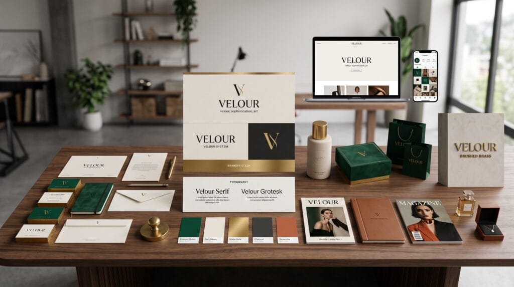
A professional identity includes more than a primary logo. It usually contains horizontal and stacked versions, a symbol, a wordmark, a monochrome version, and small-size variations.
This flexibility allows the brand to remain recognizable across a website header, social avatar, package label, mobile app, invoice, and billboard. The logo system should solve real layout problems instead of forcing one composition into every space.
2. Strategic Color Palettes
Color is one of the fastest ways to create recognition. Strong graphic design branding examples use color deliberately rather than decoratively.
A practical palette often includes:
- One or two primary brand colors
- Supporting secondary colors
- Neutral colors for backgrounds and text
- Functional colors for success, warning, and error states
- Accessibility guidance for contrast
Color should also be tested in print, on screens, in bright environments, and in low-light conditions. A palette that works only in a presentation mockup is not a complete brand system.
3. Typography with a Clear Role
Typography affects personality, readability, and hierarchy. Strong identities define which fonts are used for headlines, body text, labels, buttons, packaging information, and campaigns.
For example, an expressive display face can create recognition in headlines, while a highly readable sans serif supports body copy. The contrast gives the brand personality without sacrificing clarity.
Also Read: Graphic Design Typography Mistakes and How to Fix Them
4. Photography and Illustration Direction
A brand can lose consistency even when its logo and colors are correct. Photography, illustration, iconography, and image treatment need a shared direction.
A clear image system may define lighting, composition, background style, subject framing, editing, texture, and emotional tone. This is especially important for brands that publish content frequently.
5. Layout and Grid Consistency
Repeated layout behavior makes a brand feel organized. Margins, spacing, alignment, image proportions, and headline placement should follow a recognizable rhythm.
Strong grids do not make design boring. They create a stable structure that allows creative elements to feel intentional.
Graphic Design Branding Examples Across Customer Touchpoints
A visual identity becomes powerful when it works beyond the logo. The following touchpoints reveal whether a system is truly strong.
1. Packaging Branding
Packaging must communicate quickly. It should identify the brand, explain the product, create shelf distinction, and support purchase decisions.
Effective examples use hierarchy carefully: the brand name, product type, key benefit, variant, and required information should be easy to scan. Materials and finishes should reinforce the positioning.
2. Website and Digital Branding
Digital branding includes more than placing a logo in the header. Buttons, icons, spacing, animation, photography, illustration, and interface states should all feel connected to the identity.
A strong website translates the brand into behavior. A playful brand may use energetic motion and informal microcopy, while a premium brand may use restrained transitions, generous space, and editorial typography.
3. Social Media Branding
Social platforms require speed and variety. Brands need templates that maintain recognition without making every post identical.
A flexible social system may include recurring color fields, type treatments, framing devices, icon styles, and photo filters. Templates should be easy enough for marketing teams to use consistently.
Also Read: Graphic Design for Branding That Makes Products Look Better
4. Environmental and Signage Design
Physical spaces can turn branding into an experience. Signage, wall graphics, uniforms, menus, interiors, vehicle graphics, and wayfinding all contribute to perception.
The strongest examples simplify the brand into elements that remain recognizable at large scale and from a distance.
Comparison Table – Weak Branding vs Strong Branding
| Brand Element | Weak Execution | Strong Execution |
|---|---|---|
| Logo | One version used everywhere | Flexible logo system for multiple formats |
| Color | Random colors chosen per campaign | Defined primary, secondary, and neutral palette |
| Typography | Many unrelated fonts | Clear hierarchy with assigned font roles |
| Imagery | Inconsistent stock photos | Defined photography or illustration direction |
| Layout | Different spacing on every asset | Repeatable grid and spacing system |
| Applications | Logo placed on mockups | Identity adapted thoughtfully to each touchpoint |
| Guidelines | Informal preferences | Documented rules with practical examples |
How to Create Your Own Graphic Design Branding Examples
A strong case study or brand presentation should demonstrate thinking, not just decoration. Use the following process to create a complete and convincing identity.
- Define the brand strategy. Clarify the audience, positioning, values, personality, and competitive difference.
- Build a mood board. Collect references for typography, color, imagery, materials, and layout direction.
- Explore multiple concepts. Test different visual territories before selecting one direction.
- Develop the core identity. Create the logo system, palette, typography, imagery, and graphic elements.
- Apply the system. Test it on packaging, digital screens, social media, stationery, signage, and campaigns.
- Create guidelines. Document correct usage, spacing, hierarchy, accessibility, and common mistakes.
- Present the story. Explain how each design decision supports the brand strategy.
Use Mockups Strategically
Mockups help clients and audiences imagine the brand in the real world, but they should support the work rather than hide weak design. Include flat layouts alongside realistic mockups so viewers can inspect the actual system.
Show Range Without Losing Consistency
A strong portfolio presentation demonstrates variation within a unified identity. Show how the brand can feel energetic in a campaign, restrained in a document, and functional in a digital interface while remaining recognizable.
Best Practices for Building a Strong Brand Identity
- Start with strategy before visual styling
- Design for the audience rather than personal taste
- Create a system that works in print and digital formats
- Prioritize readability and accessibility
- Use repetition to build recognition
- Document rules so teams can apply the identity correctly
- Review the system regularly as the business grows
Also Read: Best Graphic Design Trends You Should Follow This Year
Common Mistakes in Graphic Design Branding Examples
1. Following Trends Too Closely
Trends can make a presentation feel current, but they can also make a brand look temporary. Use trends selectively and anchor the identity in the company’s long-term strategy.
2. Designing Only for Mockups
Beautiful mockups can create a false sense of completeness. Test the identity in practical situations, including small labels, mobile screens, black-and-white printing, presentations, and everyday social posts.
3. Using Too Many Visual Ideas
Strong brands are usually built from a limited number of memorable elements. Too many colors, typefaces, patterns, and effects reduce recognition.
4. Ignoring Brand Voice
Visual identity and verbal identity should support each other. A premium visual system paired with casual, inconsistent copy creates confusion.
Graphic Design Branding Examples Checklist
- Does the identity reflect the brand strategy?
- Is the logo readable at small sizes?
- Are color values documented for print and digital use?
- Does typography have a clear hierarchy?
- Are image and illustration styles defined?
- Can the system adapt across multiple touchpoints?
- Is the design accessible and readable?
- Are templates available for frequent content?
- Do guidelines explain correct and incorrect use?
- Does the brand remain distinctive in its category?
Frequently Asked Questions
1. What are graphic design branding examples?
They are visual identity applications that show how a brand uses logos, colors, typography, imagery, layout, packaging, digital design, and other assets consistently.
2. How many branding examples should a portfolio include?
One complete case study is often more persuasive than many incomplete projects. Show enough applications to prove that the system is flexible, strategic, and realistic.
3. What should be included in a brand identity presentation?
Include the strategy summary, logo system, color palette, typography, imagery, graphic elements, key applications, mockups, and practical guidelines.
4. Can small businesses benefit from professional branding?
Yes. A focused identity helps small businesses appear credible, improve recognition, communicate value, and compete more effectively.
Conclusion on Graphic Design Branding Examples
The strongest graphic design branding examples show that memorable brands are built through systems, not isolated visuals. Logos, colors, typography, imagery, layouts, packaging, digital interfaces, and physical experiences should all communicate the same strategic idea.
By studying successful examples and applying a structured process, designers and business owners can create identities that are distinctive, flexible, and consistent. The result is more than attractive design. It is a brand people can recognize, understand, and trust.
Also Read: “Graphic Design Principles Every Beginner Should Learn“