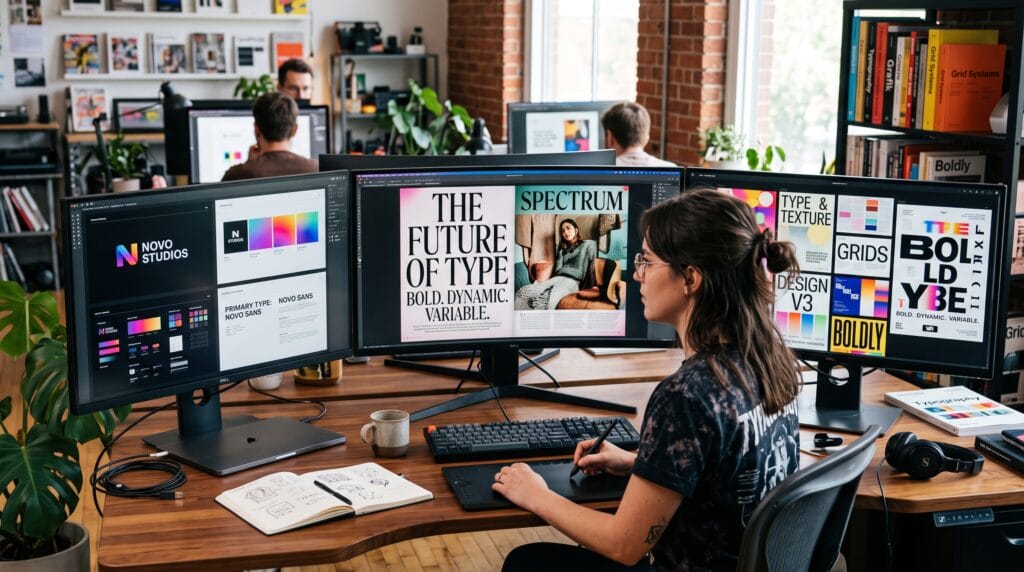
Typography has always been one of the most powerful elements of graphic design. While colors and images often attract attention first, typography determines how effectively information is communicated and how a brand is perceived. The latest graphic design typography trends combine creativity with functionality, helping designers create memorable experiences across websites, mobile applications, branding, advertising, packaging, and print materials.
In 2026, typography is evolving alongside advances in digital design, responsive interfaces, and brand storytelling. Designers are experimenting with expressive fonts, variable typography, accessibility, and minimalist layouts while ensuring readability remains a priority. This guide explores the most important graphic design typography trends every designer should understand to create modern, engaging, and user-friendly designs.
Why Typography Matters in Graphic Design
Typography influences far more than appearance.
It helps:
- Improve readability
- Strengthen brand identity
- Create visual hierarchy
- Guide user attention
- Communicate personality
- Enhance user experience
- Increase engagement
Well-chosen typography makes content easier to understand and more memorable.
What Makes Graphic Design Typography Trends Effective?
Successful typography balances creativity with usability.
Key principles include:
- Readability
- Consistency
- Proper spacing
- Visual hierarchy
- Contrast
- Accessibility
- Responsive scaling
Even the most decorative fonts should support clear communication.
Graphic Design Typography Trends
1. Variable Fonts
Variable fonts allow multiple font styles within a single font file.
Benefits include:
- Faster website performance
- Greater design flexibility
- Responsive typography
- Reduced file sizes
- Simplified font management
They are becoming increasingly popular in modern web design.
2. Bold Display Typography
Large, attention-grabbing headlines remain a dominant trend.
Best uses include:
- Landing pages
- Hero sections
- Posters
- Brand campaigns
- Magazine covers
Bold typography quickly captures attention while reinforcing brand personality.
3. Minimalist Typography
Minimalism continues to influence digital design.
Characteristics include:
- Clean layouts
- Simple font pairings
- Generous white space
- Clear hierarchy
- Limited distractions
Minimal typography improves readability and creates a premium look.
4. Oversized Headlines
Designers are increasingly using oversized text as a central visual element.
Advantages:
- Strong first impressions
- Better content hierarchy
- Increased visual impact
- Improved brand recognition
Balance oversized headlines with sufficient spacing and readable body text.
5. Experimental Typography
Creative brands are embracing more expressive typography through:
- Distorted text
- Layered typography
- Geometric layouts
- Animated lettering
- Mixed font weights
Experimental styles work best when they enhance rather than reduce readability.
6. Serif Fonts in Digital Design
Modern serif fonts are making a strong comeback.
They often communicate:
- Elegance
- Trust
- Heritage
- Sophistication
Many luxury brands and editorial websites use contemporary serif typography to create timeless visual identities.
7. High-Contrast Font Pairing
Combining different font styles creates visual interest.
Popular combinations include:
- Serif + Sans-serif
- Bold + Thin
- Large + Small
- Modern + Classic
Use contrast thoughtfully while maintaining consistency.
8. Accessible Typography
Accessibility is becoming an essential design priority.
Best practices include:
- Adequate font sizes
- High color contrast
- Comfortable line spacing
- Readable font choices
- Responsive scaling
Accessible typography improves usability for all readers.
9. Kinetic Typography
Motion typography is increasingly used in:
- Social media videos
- Website animations
- Product launches
- Advertising campaigns
Subtle movement can improve engagement when used appropriately.
10. Handwritten and Custom Fonts
Unique lettering helps brands stand out.
Applications include:
- Logos
- Packaging
- Invitations
- Lifestyle branding
- Creative campaigns
Custom typography creates a distinctive visual identity.
11. Retro and Vintage Typography
Vintage-inspired fonts continue to influence modern branding.
Popular styles include:
- Art Deco
- 1970s typography
- Retro signage
- Classic editorial lettering
These styles often evoke nostalgia while remaining visually appealing.
12. Responsive Typography
Modern typography adapts seamlessly across:
- Smartphones
- Tablets
- Laptops
- Desktop monitors
- Large displays
Responsive text improves readability regardless of screen size.
Choosing the Right Graphic Design Typography Trends
Before selecting fonts, consider:
- Target audience
- Brand personality
- Platform
- Readability
- Accessibility
- Content length
- Device compatibility
Typography should support the message rather than compete with it.
Typography Pairing Tips
Successful font combinations often follow these principles:
- Pair serif with sans-serif.
- Limit designs to two or three font families.
- Maintain consistent spacing.
- Use hierarchy through size and weight.
- Avoid combining fonts with similar characteristics.
Simple combinations usually produce cleaner results.
Typography Hierarchy Example
| Element | Recommended Style |
|---|---|
| H1 Heading | Bold, large font |
| H2 Heading | Medium weight |
| H3 Heading | Slightly smaller |
| Body Text | Highly readable font |
| Captions | Smaller but legible |
| Buttons | Bold and concise |
Clear hierarchy guides readers naturally through content.
Recommended Typography Tools
| Tool | Purpose |
|---|---|
| Adobe Fonts | Professional font library |
| Google Fonts | Free web fonts |
| Fontshare | High-quality free fonts |
| FontPair | Font pairing inspiration |
| Typewolf | Typography inspiration |
| Figma | UI and typography design |
| Adobe Illustrator | Logo and lettering design |
| Adobe InDesign | Editorial typography |
| Canva | Marketing design |
| Glyphs | Custom font creation |
These tools help designers experiment with typography efficiently.
Common Graphic Design Typography Trends Mistakes
Avoid these common errors:
- Using too many fonts
- Poor line spacing
- Weak color contrast
- Inconsistent hierarchy
- Excessive decorative fonts
- Ignoring accessibility
- Poor mobile readability
- Overcrowded layouts
Well-structured typography enhances both aesthetics and usability.
Frequently Asked Questions
1. Why is typography important in graphic design?
Typography improves readability, creates visual hierarchy, communicates brand personality, and enhances the overall user experience. It is a fundamental part of effective visual communication.
2. How many fonts should a design use?
Most professional designs work best with two or three complementary font families. Limiting font choices helps maintain consistency and clarity.
3. What are variable fonts?
Variable fonts contain multiple weights, widths, and styles within a single font file, allowing designers to create flexible, responsive typography while reducing file sizes and improving website performance.
4. Which typography trend is best for branding?
The best choice depends on the brand’s personality and audience. Clean sans-serif fonts, modern serif fonts, custom lettering, and variable fonts are all popular options when used consistently and strategically.
Graphic Design Typography Trends Checklist
- Define your visual hierarchy
- Choose readable fonts
- Pair fonts thoughtfully
- Maintain consistent spacing
- Optimize for mobile devices
- Ensure accessibility
- Test typography across screen sizes
- Keep branding consistent
- Use contrast effectively
- Review readability before publishing
Best Practices for Modern Typography
To get the most from graphic design typography trends:
- Prioritize readability before experimenting with decorative styles.
- Use typography to reinforce your brand identity and messaging.
- Take advantage of variable fonts for responsive and performance-focused web design.
- Maintain a clear hierarchy using size, weight, spacing, and contrast.
- Test typography on multiple devices and screen sizes.
- Follow accessibility guidelines to ensure content is readable for all users.
- Stay informed about emerging trends while choosing timeless solutions that support long-term brand consistency.
The most effective typography balances creativity with clarity, helping audiences engage with content effortlessly.
Conclusion on Graphic Design Typography Trends
Understanding today’s graphic design typography trends enables designers to create visually compelling work while improving readability, accessibility, and brand recognition. From variable fonts and bold display typography to minimalist layouts and responsive design, modern typography continues to evolve alongside digital experiences. By applying these trends thoughtfully and focusing on clear communication, designers can create memorable visuals that not only look contemporary but also deliver meaningful results across print, web, and mobile platforms.
Also Read: “Graphic Design Color Theory Explained with Practical Examples“