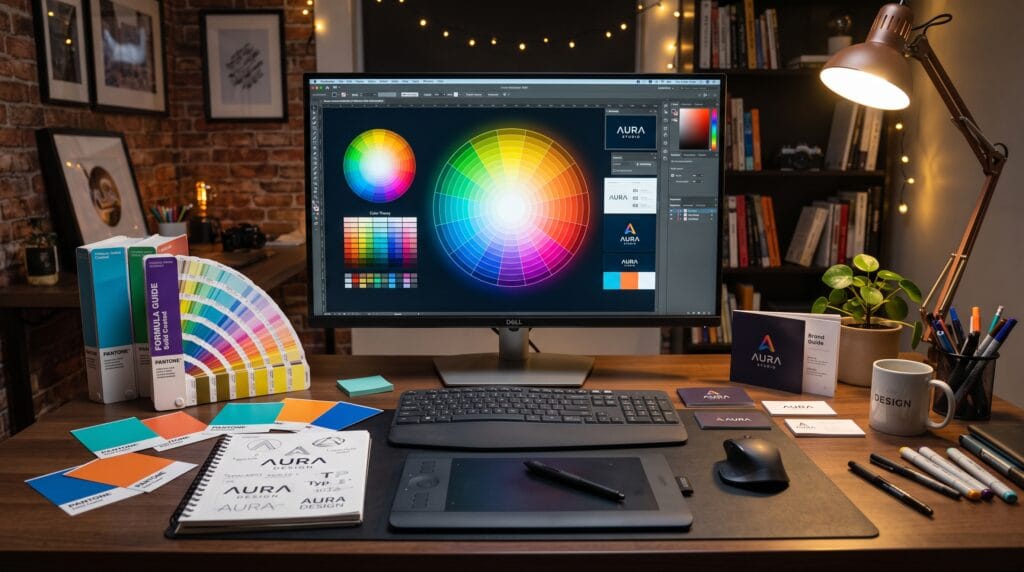
Color is one of the most powerful elements in graphic design. It influences emotions, communicates messages, establishes brand identity, and guides viewers’ attention. Whether you’re designing a logo, website, social media graphic, advertisement, or product packaging, understanding graphic design color theory helps you create visuals that are both attractive and effective.
Many beginner designers choose colors based on personal preference, but professional designers make intentional decisions using color harmony, psychology, contrast, and accessibility principles. Learning graphic design color theory enables you to build stronger visual identities, improve readability, and create memorable user experiences.
This complete guide explains color theory from the ground up with practical examples you can apply to your own design projects.
What Is Graphic Design Color Theory?
Graphic design color theory is the study of how colors interact, complement one another, and influence perception. It provides designers with guidelines for choosing color combinations that communicate specific emotions, improve usability, and strengthen visual appeal.
Color theory helps designers:
- Build attractive layouts
- Improve readability
- Create visual hierarchy
- Strengthen branding
- Guide user attention
- Influence purchasing decisions
- Communicate emotion effectively
Successful design begins with intentional color selection.
Understanding the Color Wheel
The color wheel organizes colors based on their relationships.
Primary Colors
Primary colors cannot be created by mixing other colors.
They include:
- Red
- Blue
- Yellow
These serve as the foundation for all other colors.
Secondary Colors
Secondary colors are formed by mixing two primary colors.
Examples:
- Green
- Orange
- Purple
These colors add variety while maintaining balance.
Tertiary Colors
Tertiary colors combine a primary color with a neighboring secondary color.
Examples include:
- Blue-Green
- Yellow-Orange
- Red-Orange
- Blue-Violet
- Red-Violet
- Yellow-Green
These shades provide more refined color options.
Color Harmony
Color harmony creates visually pleasing combinations.
1. Complementary Colors
Complementary colors sit opposite each other on the color wheel.
Examples:
- Blue + Orange
- Red + Green
- Purple + Yellow
Best Uses
- Call-to-action buttons
- Sports branding
- Promotional graphics
- High-contrast advertisements
Complementary colors create bold visual impact.
2. Analogous Colors
Analogous colors sit beside one another.
Example:
- Blue
- Blue-Green
- Green
Best Uses
- Nature themes
- Wellness brands
- Lifestyle websites
- Backgrounds
These combinations create harmony and calmness.
3. Triadic Colors
Triadic palettes use three evenly spaced colors.
Example:
- Red
- Yellow
- Blue
Best Uses
- Children’s brands
- Educational content
- Creative projects
- Entertainment
Triadic schemes provide balance and energy.
4. Monochromatic Colors
Monochromatic designs use different shades and tints of a single color.
Example:
- Light Blue
- Medium Blue
- Dark Blue
Best Uses
- Corporate branding
- Technology companies
- Minimalist websites
- Luxury products
This approach creates a clean and sophisticated look.
5. Split-Complementary Colors
Split-complementary palettes combine one base color with the two colors adjacent to its complement.
Example:
- Blue
- Yellow-Orange
- Red-Orange
These schemes provide strong contrast while feeling less intense than direct complementary colors.
Understanding Color Psychology
Colors influence emotions and consumer behavior.
| Color | Common Associations | Practical Example |
|---|---|---|
| Blue | Trust, professionalism, stability | Banking websites, technology companies |
| Red | Energy, passion, urgency | Clearance sales, food brands, call-to-action buttons |
| Green | Growth, health, sustainability | Eco-friendly brands, healthcare, finance |
| Yellow | Optimism, creativity, happiness | Educational brands, promotions, startups |
| Orange | Enthusiasm, confidence, friendliness | Sports brands, creative agencies |
| Purple | Luxury, creativity, wisdom | Beauty products, premium services |
| Black | Sophistication, elegance, authority | Luxury fashion, premium technology |
| White | Simplicity, cleanliness, minimalism | Healthcare, modern websites |
| Gray | Neutrality, professionalism, balance | Corporate presentations, business websites |
Choose colors based on the emotions you want your audience to experience.
Warm vs. Cool Colors
Warm Colors
Include:
- Red
- Orange
- Yellow
Warm colors create:
- Excitement
- Passion
- Energy
- Urgency
Ideal for promotions and action-oriented designs.
Cool Colors
Include:
- Blue
- Green
- Purple
Cool colors communicate:
- Trust
- Calmness
- Reliability
- Professionalism
These colors are common in healthcare, finance, and technology branding.
Practical Examples of Graphic Design Color Theory
1. Technology Company
Recommended Colors
- Primary: Blue
- Secondary: White
- Accent: Cyan
Why It Works
Blue builds trust, white improves readability, and cyan adds a modern feel.
2. Organic Food Brand
Recommended Colors
- Green
- Brown
- Beige
Why It Works
These natural colors communicate sustainability, freshness, and authenticity.
3. Luxury Fashion Brand
Recommended Colors
- Black
- Gold
- White
Why It Works
The combination conveys elegance, exclusivity, and premium quality.
4. Children’s Education Brand
Recommended Colors
- Yellow
- Blue
- Red
Why It Works
Bright, vibrant colors create excitement, creativity, and friendliness.
5. Health & Wellness Website
Recommended Colors
- Soft Green
- White
- Light Blue
Why It Works
These colors evoke cleanliness, relaxation, and trust.
Creating Effective Color Palettes
Professional palettes often include:
- Primary Color – Main brand color
- Secondary Color – Supports the primary color
- Accent Color – Highlights important actions
- Neutral Colors – Backgrounds and text
A balanced palette keeps designs cohesive and visually appealing.
Accessibility and Color
Good design should be accessible to all users.
Follow these best practices:
- Maintain sufficient color contrast
- Avoid relying on color alone to communicate meaning
- Use readable text colors
- Test designs for color blindness
- Keep interfaces clear and consistent
Accessible color choices improve usability and inclusivity.
Common Mistakes of Graphic Design Color Theory
Avoid these beginner mistakes:
- Using too many colors
- Choosing colors without purpose
- Poor contrast between text and background
- Ignoring brand consistency
- Overusing highly saturated colors
- Forgetting accessibility requirements
- Inconsistent color palettes across projects
Simple, intentional palettes usually produce stronger results.
Recommended Color Tools
| Tool | Purpose |
|---|---|
| Adobe Color | Color harmony generation |
| Coolors | Palette creation |
| Color Hunt | Design inspiration |
| Happy Hues | Website color combinations |
| Coolors Contrast Checker | Accessibility testing |
| Canva Color Palette Generator | Palette extraction from images |
| Google Fonts | Typography pairing |
| Figma | UI color systems |
These tools help designers create balanced and accessible color schemes.
Frequently Asked Questions of Graphic Design Color Theory
1. What is graphic design color theory?
Graphic design color theory is the study of how colors relate to one another and how they influence visual communication, branding, usability, and emotional responses.
2. Why is color theory important?
Color theory helps designers create visually balanced designs, communicate messages effectively, improve readability, and establish strong brand identities.
3. How many colors should a design use?
Most professional designs use three to five primary colors, supported by neutral shades. Keeping the palette focused improves consistency and avoids visual clutter.
4. How do I choose colors for my brand?
Start with your brand’s personality and audience. Consider the emotions you want to evoke, then build a palette with one primary color, one or two supporting colors, an accent color, and neutral tones for balance.
Graphic Design Color Theory Checklist
- Understand the color wheel
- Choose a balanced color palette
- Apply color psychology intentionally
- Use sufficient contrast for readability
- Maintain brand consistency
- Limit unnecessary colors
- Test accessibility
- Use accent colors strategically
- Review designs on multiple devices
- Refine palettes through user feedback
Best Practices for Using Color in Graphic Design
To make the most of graphic design color theory:
- Start with your brand identity and target audience.
- Build a consistent color palette before designing.
- Use contrast to improve readability and highlight key elements.
- Limit the number of dominant colors to maintain visual harmony.
- Test your designs for accessibility and different screen types.
- Study successful brands to understand effective color usage.
- Remember that color should support communication, not distract from it.
Thoughtful color choices can dramatically improve both aesthetics and user experience.
Conclusion on Graphic Design Color Theory
Mastering graphic design color theory is one of the most valuable skills any designer can develop. By understanding the color wheel, harmony, psychology, contrast, and accessibility, you can create designs that communicate clearly, strengthen brand identity, and evoke the right emotional response. Whether you’re designing logos, websites, advertisements, packaging, or social media graphics, thoughtful color selection transforms ordinary visuals into memorable and effective design solutions. As you continue practicing, you’ll discover that successful color choices are not based on personal preference alone, they are guided by strategy, purpose, and a deep understanding of how people perceive and respond to color.
Also Read: “25 Graphic Design Ideas to Spark Your Creativity“