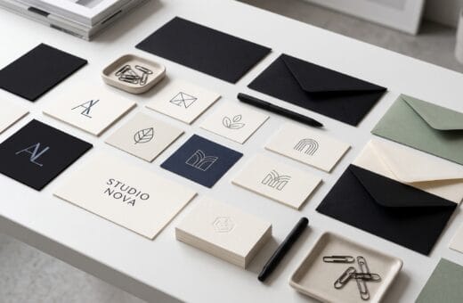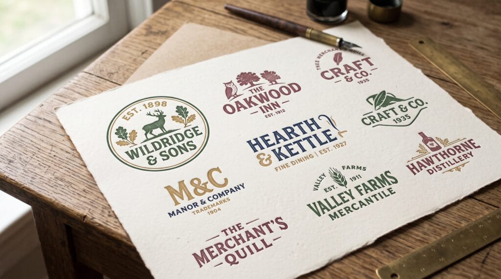
Great vintage branding feels familiar without looking outdated. The strongest vintage logo design inspiration comes from understanding why historic marks still communicate trust, craft, personality, and permanence.
Instead of copying an old badge or adding random distress, skilled designers study the visual logic behind enduring identities.
Vintage logos often combine expressive typography, simple symbols, balanced geometry, and limited color palettes. These ingredients can create a sense of heritage even for a new business.
They are especially effective for:
- Restaurants
- Coffee shops
- Barbers
- Apparel labels
- Craft products
- Outdoor brands
- Breweries
- Bakeries
- Hotels
- Premium service companies
This guide explores timeless vintage styles, practical design principles, typography choices, color systems, common mistakes, and a repeatable process for creating a logo that feels authentic and usable.
Why Vintage Logo Design Inspiration Remains Popular
Vintage design continues to attract brands because it offers emotional depth that many ultra-modern identities lack.
A historic visual language can suggest:
- Experience
- Care
- Quality
- Tradition
- Human craftsmanship
- Local character
- Long-term reliability
Effective vintage logo design inspiration can help a business:
- Communicate heritage or tradition
- Stand apart from minimal technology branding
- Create a memorable personality
- Support premium or handcrafted positioning
- Build a cohesive packaging system
- Work well on signage, apparel, stamps, and labels
- Create a strong sense of place or community
The appeal is not simply nostalgia.
Vintage visual systems often use clear shapes, bold lettering, and compact compositions that reproduce well across physical products. A well-designed badge can work on a storefront, coffee cup, product label, shirt, website, or rubber stamp.
Core Elements of Timeless Vintage Logo Design Inspiration
A vintage logo does not need every traditional design element. The best examples select a few appropriate ingredients and use them consistently.
Classic Typography
Typography usually carries most of the personality in a vintage logo.
Common choices include:
- Slab serif fonts
- Old-style serif fonts
- Sign-painter scripts
- Condensed display typefaces
- Engraved capitals
- Industrial sans serifs
- Custom hand lettering
Choose typography that fits the brand story.
A refined serif may suit a heritage hotel or premium tailor. A bold slab serif may work better for a workshop, brewery, or outdoor company. A casual script can support a bakery, barber, restaurant, or lifestyle brand.
Avoid selecting a typeface simply because it is labeled “retro.” The letterforms must support the brand’s personality and remain readable.
Badge and Emblem Structures
Circles, shields, arches, ribbons, seals, and oval frames are common in vintage branding because they organize several pieces of information into one compact mark.
A badge can include:
- The business name
- A founding year
- A location
- A product category
- A short tagline
- A simple icon
- A monogram
Use only the information that remains legible at practical sizes.
A logo does not become more authentic because it contains more words. Small dates, taglines, and decorative text often disappear when the logo is used on mobile screens or small packaging.
Hand-Drawn Symbols
Illustrated symbols add warmth and individuality.
Popular subjects include:
- Tools
- Mountains
- Animals
- Plants
- Vehicles
- Cups
- Food ingredients
- Stars
- Crowns
- Local landmarks
- Product-making equipment
Keep illustration details controlled.
A symbol must remain recognizable when it is embroidered, stamped, engraved, or printed at a small size. Fine shading may look attractive on a large presentation but fail in production.
Limited Color Palettes
Many timeless vintage logos use two or three colors.
Restricted palettes feel cohesive and are easier to reproduce across packaging, signage, clothing, labels, and merchandise.
Popular combinations include:
- Cream and black
- Burgundy and tan
- Forest green and gold
- Navy and ivory
- Rust and charcoal
- Faded red and blue
- Brown and warm white
A limited palette also helps the logo retain its character when reproduced in one color.
Subtle Texture
Texture can suggest age, handmade production, letterpress printing, or ink on paper.
Use distress carefully.
The clean vector version should remain the primary logo. Textured treatments can be created as secondary variations for posters, packaging, social content, and environmental graphics.
A logo that only works when heavily distressed is not flexible enough.
Timeless Vintage Logo Styles and Examples
Different vintage styles communicate different personalities. Selecting a specific direction produces a more convincing identity than combining unrelated historical references.
Heritage Crest Logos
Heritage crests use shields, crowns, initials, leaves, animals, or decorative framing.
They work well for:
- Hotels
- Fashion labels
- Premium food products
- Wedding businesses
- Property companies
- Established service brands
- Private clubs
- Luxury packaging
A strong crest simplifies historic references instead of reproducing every ornamental detail.
For example, a boutique hotel might use a shield containing one initial, framed by two simplified botanical branches. A small founding year could sit below the shield, with the hotel name presented in an elegant serif.
Circular Badge Logos
Circular badges are practical, versatile, and easy to apply to packaging, stickers, uniforms, signs, and social media avatars.
They often use curved lettering around a central icon.
For a coffee roaster, the center might feature:
- A coffee bean
- A mountain
- A bird
- A roasting tool
- A local landmark
For an outdoor company, the center could use:
- A tree line
- A compass
- An animal silhouette
- A tent
- A river
- A climbing symbol
The circular structure creates immediate unity, but the spacing around curved text must be carefully adjusted.
Letterpress-Inspired Wordmarks
Letterpress-inspired logos use strong typography, generous spacing, and controlled imperfections.
They are effective for:
- Stationery brands
- Bakeries
- Creative studios
- Craft businesses
- Independent publishers
- Specialty retailers
The best versions feel printed rather than digitally damaged.
Texture should follow the natural appearance of ink and paper. Avoid placing the same artificial distress pattern across every letter.
Sign-Painter Script Logos
Sign-painter scripts create friendliness, movement, and handcrafted character.
They often suit:
- Restaurants
- Salons
- Apparel brands
- Automotive businesses
- Barbers
- Local shops
- Food products
Pair an expressive script with a simpler supporting typeface.
The script can carry the business name, while a condensed sans serif or small serif handles the location, category, or founding year.
Industrial Vintage Logos
Industrial identities use:
- Condensed typography
- Bold numerals
- Geometric frames
- Mechanical symbols
- Heavy line weights
- Rivet-inspired details
- Practical color palettes
They suit workshops, breweries, manufacturers, garages, tool brands, and workwear labels.
The design should feel dependable and functional rather than overloaded with decoration.
Mid-Century Retro Logos
Mid-century marks use optimistic shapes, simple illustrations, angled layouts, starbursts, and warm color combinations.
They work well for:
- Diners
- Travel brands
- Entertainment businesses
- Lifestyle products
- Furniture companies
- Creative agencies
- Hospitality brands
These logos can feel playful, but the composition still needs discipline.
One starburst, one expressive wordmark, and one limited palette will usually perform better than a collection of unrelated retro effects.
Old-World Monograms
Monograms combine initials through:
- Interlocking
- Overlapping
- Mirroring
- Stacking
- Decorative framing
- Shared strokes
They can feel formal, luxurious, romantic, or institutional.
Monograms are effective for fashion, hospitality, weddings, property brands, and premium services when the letterforms remain distinct.
Also Read: AI Vintage Logo Prompts for Old Money Luxury Vintage Marks
Vintage Logo Typography That Feels Authentic
Typography is the most important decision in many retro identities.
A poor font choice can make the work feel like a costume. A strong type system can create a vintage impression even without illustration or texture.
Best Font Categories
Useful vintage typography categories include:
- Old-style serif fonts for heritage and trust
- Slab serif fonts for strength and craftsmanship
- Condensed display fonts for badges and packaging
- Script fonts for warmth and personality
- Engraved capitals for premium identities
- Humanist sans serifs for readable supporting text
The typeface should match the chosen era and the brand’s positioning.
A 1950s diner identity, for example, should not use the same typography as a Victorian-inspired hotel crest.
How to Pair Vintage Fonts
Use one expressive font and one restrained font.
Good pairings may include:
- Decorative script with condensed sans serif
- Slab serif with simple old-style serif
- Engraved capitals with a neutral sans serif
- Bold display type with small serif text
- Custom lettering with a practical supporting font
Limit the system to two type families unless a complex identity genuinely requires more.
Too many fonts can make the logo feel like a collection of unrelated references.
Typography Details to Adjust
Professional results depend on small refinements.
Review:
- Kerning between individual letters
- Tracking in curved text
- Stroke weight at small sizes
- Capital and lowercase balance
- The size of dates and taglines
- Baseline alignment
- Script connections
- The relationship between the wordmark and icon
Custom lettering adjustments often make the difference between a template and a professional identity.
Vintage Color Palettes for Timeless Branding
Color plays an important role in defining the age, mood, and industry of a vintage logo.
Warm Heritage Palette
Use:
- Burgundy
- Cream
- Dark brown
- Muted gold
This palette works well for restaurants, hospitality, food packaging, wineries, and premium service businesses.
Outdoor Heritage Palette
Use:
- Forest green
- Tan
- Rust
- Deep navy
This system suits outdoor products, workwear, travel companies, camps, and coffee brands.
Classic Americana Palette
Use:
- Faded red
- Navy
- Warm white
- Mustard
This palette supports sports, diners, apparel, community brands, and entertainment businesses.
Monochrome Engraving Palette
Use:
- Black
- Ivory
- Gray
A monochrome palette creates a sophisticated identity that relies on linework, form, and typography.
It is particularly effective for editorial brands, barbers, specialty products, and heritage services.
Luxury Vintage Palette
Use:
- Black
- Antique gold
- Cream
- Deep green
This palette suits premium products, fashion, weddings, boutique hospitality, jewelry, and event branding.
Vintage Color Comparison Table
| Palette | Best For | Visual Effect |
|---|---|---|
| Burgundy and cream | Food, hospitality, publishing | Warm and established |
| Forest green and tan | Outdoor, coffee, craft goods | Natural and dependable |
| Navy and ivory | Apparel, marine, professional services | Classic and trustworthy |
| Black and antique gold | Luxury, events, premium retail | Refined and exclusive |
| Rust and charcoal | Workshops, automotive, industrial | Rugged and practical |
Always test the palette in one color before approving the final logo.
Vintage Restaurant Logo Design Inspiration
Restaurants are a natural fit for vintage branding because food businesses often depend on tradition, place, atmosphere, and personal stories.
A timeless restaurant logo might use:
- A circular seal with the restaurant name and founding year
- A hand-drawn ingredient or cooking tool
- A bold serif wordmark with a small script accent
- A monogram for menus and napkins
- A simplified building or local landmark
- A limited palette that matches the interior
- A compact stamp for packaging
A bakery might use a wheat illustration with an arched serif wordmark.
A steakhouse could use a strong slab serif, a restrained cattle illustration, and a burgundy-and-cream palette.
A seafood restaurant might combine a simple fish engraving with navy typography and an oval frame.
Create several logo variations:
- A primary badge
- A horizontal wordmark
- A simple icon
- A one-color stamp
- A small social media version
This system helps the restaurant maintain a consistent identity across menus, signs, uniforms, packaging, and digital platforms.
Also Read: Vintage Restaurant Logo Design for Better Branding Results
How to Create a Vintage Logo Step by Step
The best vintage logo design inspiration becomes useful when it is translated into a practical design process.
1. Define the Brand Story
Decide which part of the business should feel historic.
It may be:
- A family tradition
- A local location
- A production method
- A product category
- A founder’s story
- A desired customer experience
- A regional influence
Do not invent a false history.
A new company can use heritage-inspired aesthetics without pretending to be older than it is.
2. Choose a Specific Era or Influence
Select a clear direction, such as:
- Victorian engraving
- 1920s hospitality
- 1930s workwear
- 1950s diner graphics
- Mid-century travel
- Industrial workshop branding
- 1970s outdoor design
- Traditional European packaging
Mixing too many eras usually weakens authenticity.
A Victorian border, 1950s script, and 1970s color palette may individually look attractive but feel inconsistent when combined.
3. Build a Reference Board
Collect references for:
- Lettering
- Framing
- Symbols
- Packaging
- Signage
- Print texture
- Illustration
- Color
- Photography
- Materials
Study original materials rather than relying only on modern retro templates.
Historical packaging, storefronts, labels, posters, matchbooks, menus, and tools often provide more useful insight than contemporary imitations.
4. Sketch the Composition
Create small black-and-white sketches before selecting final fonts or colors.
Test:
- Circles
- Arches
- Shields
- Horizontal lockups
- Monograms
- Seals
- Wordmarks
- Icon-and-type combinations
Strong composition should work without texture.
Small thumbnail sketches help reveal which concepts remain clear and balanced.
5. Select and Customize Typography
Choose a typeface with the right character, then refine:
- Spacing
- Terminals
- Swashes
- Stroke weight
- Letter relationships
- Curved text
- Supporting information
Avoid using a default font without adjustment.
Even small changes to kerning or letter shape can make the identity feel more distinctive.
6. Simplify the Symbol
Reduce the icon until it is recognizable at a small size.
Remove unnecessary:
- Shading
- Lines
- Textures
- Interior shapes
- Decorative details
A detailed illustration can be included in the broader brand system, but the main logo symbol should remain practical.
7. Build a Flexible Logo System
Create:
- A primary logo
- A secondary horizontal logo
- A compact badge
- A standalone icon or monogram
- A one-color version
- A reversed version
- A small-size version
- A clean and textured variation
This system keeps the branding consistent across different applications.
8. Test Real-World Applications
Place the logo on:
- Menus
- Labels
- Storefront signs
- Websites
- Uniforms
- Boxes
- Stamps
- Social media icons
- Embroidery
- Business cards
- Vehicle graphics
Practical testing reveals problems that may be invisible on an artboard.
A detailed tagline may disappear on a small label. A thin script may fail when embroidered. A badge may become unreadable in a social media profile image.
How AI Can Support Vintage Logo Design Inspiration
AI image tools can help designers explore mood, icon ideas, badge structures, color directions, and stylistic references.
They are most useful during concept development, not as a replacement for final vector craftsmanship.
Vintage Logo Prompt Formula
Use this structure:
Brand Type + Vintage Era + Logo Structure + Typography Style + Central Symbol + Color Palette + Texture + Application
Example:
Heritage coffee roaster logo, 1930s circular badge, bold slab serif lettering, hand-drawn mountain and coffee branch, forest green and cream palette, subtle letterpress texture, packaging-ready composition.
Another example:
Premium men’s tailor monogram, Victorian-inspired crest, intertwined initials, elegant engraved serif lettering, black and antique gold palette, restrained ornamental border, luxury garment label presentation.
Refine AI Concepts Professionally
AI output should normally be treated as visual exploration.
Before using a concept commercially:
- Redraw the selected idea as a vector.
- Correct the typography.
- Simplify shapes.
- Check proportions and symmetry.
- Create one-color versions.
- Confirm the artwork is original.
- Test the logo at multiple sizes.
- Prepare production-ready files.
Do not rely on inaccurate AI-generated lettering as the final wordmark.
Also Read: Vintage Logo AI Prompts for Better Retro Branding Results
Common Vintage Logo Design Mistakes
1. Using Too Much Distress
Heavy texture can destroy legibility and make a logo difficult to reproduce.
Keep a clean master version and apply texture only when appropriate.
2. Copying Famous Historic Marks
Inspiration should lead to original work.
Avoid copying recognizable:
- Crests
- Mascots
- Lettering arrangements
- Symbols
- Packaging systems
- Trademarks
Study the principles behind a reference rather than reproducing its appearance.
3. Adding Too Many Elements
A badge does not need a date, location, tagline, icon, border, stars, ribbons, and several fonts at the same time.
Remove anything that does not improve meaning.
4. Choosing Style Before Strategy
Vintage aesthetics must support the brand position.
A retro logo is not automatically appropriate for every technology, healthcare, finance, or professional brand.
The style should help the intended audience understand the company.
5. Ignoring Small-Size Legibility
Fine lines and tiny text may disappear on mobile screens, embroidery, stamps, or small labels.
Create simplified versions for restricted applications.
6. Using Unlicensed Fonts
Confirm that fonts are licensed for logo and commercial use.
Custom lettering can reduce dependence on a standard font and create a more distinctive identity.
Vintage Logo Design Inspiration Checklist
Use this checklist before approving a vintage identity:
- The style supports the brand story.
- The chosen era is clear and consistent.
- The logo works in black and white.
- Typography remains readable.
- The symbol is recognizable at small sizes.
- The design has a clean master version.
- Texture is optional rather than essential.
- The logo system includes multiple lockups.
- Fonts and artwork are properly licensed.
- The design has been tested on real applications.
- The final mark has been checked for originality.
- Supporting colors and typography are documented.
Frequently Asked Questions
1. What Makes a Logo Look Vintage?
Vintage logos typically use historic typography, badge structures, limited colors, hand-drawn symbols, ornamental framing, or print-inspired texture.
The effect should come from the complete visual system rather than one filter.
2. What Businesses Benefit Most From Vintage Logos?
Vintage visual language often works well for:
- Restaurants
- Coffee shops
- Barbers
- Breweries
- Apparel labels
- Craft products
- Outdoor brands
- Bakeries
- Hotels
- Local service businesses
The style is most effective when heritage, craft, atmosphere, or community is relevant to the brand.
3. Can a New Business Use a Heritage-Style Logo?
Yes.
A new company can use heritage-inspired design to communicate craft, warmth, or permanence, provided it does not make false claims about its age or history.
4. How Many Colors Should a Vintage Logo Use?
Two or three colors are often enough.
A limited palette improves cohesion and makes production easier. The logo should also remain effective in one color.
5. Should a Vintage Logo Always Include Texture?
No.
Texture should be an optional application. The main logo should work as a clean vector in one color.
6. Which Fonts Work Best for Vintage Logo Design?
Old-style serifs, slab serifs, condensed display fonts, sign-painter scripts, and engraved capitals are common choices.
The best font depends on the brand personality, industry, and chosen historical influence.
7. What Is the Difference Between Vintage and Retro Logo Design?
Vintage design often references older craftsmanship, heritage, or historic printing traditions.
Retro design can reference more recent periods, such as the 1950s, 1960s, 1970s, or 1980s, and may use brighter, more playful visual elements.
The terms are sometimes used interchangeably, but identifying a specific era helps produce a clearer design direction.
Conclusion on Vintage Logo Design Inspiration
The best vintage logo design inspiration comes from studying enduring design principles rather than decorating a modern logo with artificial age.
Strong typography, clear composition, meaningful symbols, limited color, and flexible applications create identities that feel established and memorable.
Choose a specific influence, simplify every element, and test the design in real situations.
A successful vintage logo should communicate history and personality while still functioning as a modern brand asset.
Also Read: “Brand Color Psychology: Choosing Colors That Build Trust“