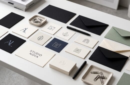
A logo is often the smallest visual element in a brand system, yet it carries a demanding job. It must help people recognize a business quickly, work across many sizes and materials, communicate the right personality, and remain useful for years. Creating a memorable logo design from scratch therefore requires more than choosing an attractive font or drawing a clever icon.
The strongest logos begin with strategy. Designers first understand the brand, audience, category, competition, and practical applications. They then explore many ideas, simplify the strongest concept, test it in realistic conditions, and build a flexible logo system rather than delivering one isolated file.
A memorable logo does not need to explain everything about a company. It needs to create a distinct visual cue that becomes meaningful through repeated use. Simplicity, relevance, recognition, flexibility, and consistency matter more than decoration.
This guide explains how to create a memorable logo design from the first brand questions to final delivery. It covers research, creative direction, sketching, logo types, typography, color, negative space, scalability, testing, presentation, file formats, common mistakes, and a practical checklist.
What Makes a Logo Memorable?
Memorability comes from a combination of distinctiveness and clarity.
A strong logo is usually:
- Easy to recognize
- Simple enough to recall
- Relevant to the brand
- Different from direct competitors
- Readable at small sizes
- Effective in one color
- Flexible across applications
- Consistent with the wider identity
A complicated logo may attract attention during a presentation but fail in a social avatar, product label, website header, embroidered uniform, or small mobile interface.
The goal is not to create the most detailed mark. The goal is to create a visual idea that people can identify quickly and associate with the brand over time.
Start With Brand Strategy
Before sketching, define what the logo needs to represent.
Clarify the Brand Purpose
Ask:
- Why does the organization exist?
- What problem does it solve?
- What value does it create?
- What does it want to be known for?
- What should customers feel after interacting with it?
These answers prevent random design decisions.
A sustainable skincare company may need to communicate care, credibility, simplicity, and environmental responsibility. A competitive gaming brand may need to communicate energy, confidence, speed, and community.
Define the Audience
Document:
- Demographics
- Needs
- Expectations
- Buying motivations
- Visual preferences
- Cultural context
- Typical environments
- Digital platforms
A logo for a children’s learning platform should communicate differently from one for a cybersecurity consultancy.
Audience research also helps prevent a designer from choosing a style simply because it matches personal taste.
Identify Brand Personality
Choose three to five personality traits.
Examples include:
- Confident
- Friendly
- Precise
- Playful
- Premium
- Calm
- Innovative
- Traditional
- Energetic
- Approachable
These traits should influence shape, typography, spacing, color, and composition.
“Premium” may suggest controlled spacing, refined typography, and a restrained palette. “Playful” may support rounded shapes, energetic composition, and brighter colors.
Write a Positioning Statement
Use this structure:
For (audience), (brand) is the (category) that provides (benefit) because (reason to believe).
Example:
For independent retailers, Northline is the inventory platform that makes stock management easier because it combines real-time tracking with simple daily workflows.
A clear positioning statement creates a strategic filter for every logo concept.
Research the Market and Competitors
Research helps designers understand category expectations and avoid visual duplication.
Review Direct Competitors
Collect competitor logos and record:
- Common colors
- Common symbols
- Typical type styles
- Repeated shapes
- Industry clichés
- Opportunities for differentiation
A financial category may be dominated by blue, shields, upward arrows, and geometric sans-serif typography. That does not mean every new brand must reject those signals, but it should understand how to use them differently.
Study the Wider Category
Look beyond direct competitors.
A coffee brand may learn from hospitality, food packaging, lifestyle retail, architecture, and community brands. A technology company may explore publishing, industrial design, science, or transportation for more distinctive visual references.
Build a Visual Audit
Create a board containing:
- Competitor logos
- Related visual references
- Typography directions
- Color patterns
- Packaging or interface examples
- Common symbols
- Symbols to avoid
The objective is not to copy references. It is to understand the visual environment.
Look for White Space
Ask:
- Which colors are overused?
- Which symbols appear repeatedly?
- Which brand personalities are missing?
- Can the brand communicate its category without repeating obvious imagery?
- Is there an opportunity to use a different silhouette or typographic direction?
A memorable logo design often balances familiarity with one distinctive idea.
Write a Clear Logo Design Brief
A useful brief turns research into design requirements.
Include:
- Brand name
- Tagline, when required
- Industry
- Audience
- Positioning
- Personality traits
- Competitor notes
- Preferred logo types
- Required applications
- Color restrictions
- Symbols to avoid
- Technical needs
- Approval process
Example:
Create a logo for Northfield Studio, a strategic design consultancy serving growing technology companies. The identity should feel intelligent, calm, modern, and dependable. The logo must work in a website header, proposal, social avatar, presentation, and one-color print. Avoid lightbulbs, rockets, arrows, and generic technology symbols.
A focused brief makes concept generation and evaluation easier.
Choose the Right Logo Type
Different logo structures solve different problems.
Wordmark
A wordmark uses the brand name as the main logo.
It is well suited to:
- Short names
- Distinctive names
- Service businesses
- Fashion brands
- Media companies
- Technology products
Wordmarks depend heavily on typography, kerning, proportion, and spacing.
Lettermark
A lettermark uses initials.
It works well for:
- Long names
- Multiword organizations
- Personal brands
- Corporate groups
- Professional services
Lettermarks require careful construction because many initial combinations already exist.
Symbol Mark
A symbol represents the brand without text.
This can be effective for established brands or identities with a highly distinctive idea. New brands often need the name beside the symbol until recognition grows.
Combination Mark
A combination mark pairs a symbol with a wordmark.
This structure offers flexibility because the elements can appear together or separately after recognition develops.
Badge or Emblem
A badge places text and symbols inside an enclosed shape.
It can work well for:
- Cafés
- Makers
- Sports brands
- Schools
- Heritage businesses
- Product packaging
Badge designs can become difficult to read when too much information is included.
Mascot Logo
A mascot uses a character or illustrated figure.
It is useful for brands that need personality, storytelling, merchandise, entertainment, or community engagement.
Also Read: Simple Logo Design Ideas: Guide for Startups and Shops
Generate Many Concepts Before Refining
The first idea is rarely the strongest.
Create Word Lists
Write words associated with:
- Brand purpose
- Customer outcomes
- Product features
- Personality
- Industry
- Metaphors
- Emotions
- Motion
- Shape
Then combine unexpected pairs.
A financial education brand might explore:
- Path
- Compass
- Foundation
- Balance
- Steps
- Clarity
- Momentum
A delivery company might explore connection, movement, route, reliability, location, handoff, or arrival.
Create Concept Territories
Develop three different creative territories.
For example:
- Structured confidence
- Human guidance
- Forward momentum
Each territory should have a clear strategic reason and a distinct visual approach.
Avoid Designing One Idea Three Ways
Three color variations of the same symbol are not three concepts.
The directions should differ in meaning, form, composition, or communication approach.
Sketch Before Opening Software
Sketching helps designers explore quickly without becoming attached to polished details.
Use Thumbnail Sketches
Draw small concepts using basic shapes.
A practical target is:
- 20 to 30 quick sketches
- Five stronger concepts
- Three refined directions
At this stage, speed and variety matter more than precision.
Work in Black and White
Color can make a weak idea appear stronger than it is.
A concept that works in black and white has a better structural foundation.
Focus on the Silhouette
Ask:
- Is the outer shape distinctive?
- Can the mark be recognized without internal details?
- Does it remain clear at small sizes?
- Does it look different from competitors?
Draw the Logo From Memory
After stepping away from the sketches, try to redraw the strongest ideas.
When the basic form is difficult to remember, the concept may be too complicated.
Use Simple Shapes With Intention
Basic shapes communicate different qualities.
Circles
Circles may suggest:
- Community
- Continuity
- Friendliness
- Unity
- Movement
Squares and Rectangles
Squares may communicate:
- Stability
- Structure
- Reliability
- Order
- Strength
Triangles
Triangles may communicate:
- Direction
- Energy
- Progress
- Ambition
- Tension
Shape meaning is not universal, but it can guide early exploration.
Build Consistent Geometry
Use:
- Shared angles
- Repeated curves
- Consistent stroke weights
- Balanced proportions
- Alignment guides
Consistent construction makes a simple logo feel intentional and professional.
Use Negative Space Carefully
Negative space can create a second image or hidden meaning without adding visual clutter.
A strong negative-space idea should be:
- Relevant
- Easy to notice
- Simple
- Clear at small sizes
- Helpful rather than distracting
When the hidden idea requires a long explanation, simplify it.
A memorable logo design should not depend entirely on a visual trick.
Choose Typography Strategically
Typography often determines whether a logo feels credible or generic.
Match the Typeface to the Personality
Serif typefaces may feel:
- Established
- Editorial
- Refined
- Traditional
- Authoritative
Sans-serif typefaces may feel:
- Modern
- Clear
- Accessible
- Technical
- Minimal
Script typefaces may feel:
- Personal
- Creative
- Elegant
- Handmade
Display typefaces may feel:
- Distinctive
- Bold
- Expressive
- Niche
Prioritize Readability
Test the brand name:
- At small sizes
- On mobile
- In uppercase
- In title case
- On dark backgrounds
- In one color
A stylish font is not useful when customers cannot identify the name quickly.
Adjust Kerning Manually
Default spacing is rarely perfect for a logo.
Pay close attention to letter pairs involving:
- A
- T
- V
- W
- Y
- L
- Curved letters
- Punctuation
Spacing should appear optically balanced rather than merely mathematically equal.
Customize With Restraint
A small custom detail may create distinction.
Random cuts, distorted letters, and excessive ligatures can reduce readability and make the logo feel forced.
Limit Font Families
A logo usually needs one main typeface and, when necessary, one supporting typeface.
Also Read: Startup Logo Typography Mistakes and How to Fix Them
Design the Logo in One Color First
A strong logo should work before color is added.
One-color testing reveals:
- Weak shapes
- Poor contrast
- Unclear overlaps
- Inconsistent spacing
- Excessive detail
- Dependence on visual effects
Create:
- Black on white
- White on black
- One-color brand version
When the logo only works with gradients, shadows, texture, or lighting effects, it may be difficult to reproduce consistently.
Choose a Focused Color Palette
Color supports recognition and emotion, but it should not carry the entire concept.
Start With One Primary Color
Choose one color that supports the brand personality.
Then add:
- One supporting color
- Neutral colors
- One optional accent
Consider Practical Applications
Test colors in:
- Digital interfaces
- Packaging
- Signage
- Social graphics
- Light backgrounds
- Dark backgrounds
Check Contrast
The wordmark and essential visual elements must remain readable.
A pale palette may feel sophisticated but fail when contrast is too weak.
Avoid Trend Dependence
A fashionable palette may look fresh today but date the identity quickly.
Choose colors that support positioning instead of simply following current aesthetics.
Simplify the Strongest Concept
Simplification is not removing personality. It is removing anything that does not improve recognition.
Ask about every element:
- Does it support the idea?
- Does it improve recognition?
- Does it improve balance?
- Does it survive at small sizes?
- Is it necessary?
Remove:
- Extra outlines
- Tiny details
- Multiple symbols
- Decorative effects
- Unnecessary gradients
- Repeated visual ideas
The objective is a memorable logo design that can be understood quickly.
Build the Logo as Vector Artwork
Vector files can scale without losing quality.
Common vector-design tools include:
Use Clean Construction
Check:
- Anchor points
- Curves
- Stroke consistency
- Alignment
- Optical balance
- Overlapping paths
- Shape symmetry
Use as few anchor points as practical. Unnecessary points often create uneven curves.
Outline Final Lettering Carefully
Keep an editable source version with live text.
Create an outlined delivery version when required for production, but preserve the editable original.
Test Scalability
A logo must work from a favicon to a large sign.
Test at:
- 16 pixels
- 24 pixels
- 32 pixels
- 64 pixels
- Website-header size
- Business-card size
- Large-format size
Create a Small-Size Variant
A detailed badge may need:
- Shorter text
- Thicker strokes
- A removed tagline
- A simplified icon
- Increased spacing
This is not a different identity. It is a responsive logo variation.
Test the Logo in Real Applications
Mockups reveal problems that are difficult to see on an empty artboard.
Test the logo on:
- Website header
- Mobile navigation
- Social avatar
- Business card
- Email signature
- Packaging
- Storefront sign
- Uniform
- Product label
- Presentation
- Invoice
- Merchandise
Check whether the logo remains visible, balanced, recognizable, and appropriate.
Compare Concepts With a Scorecard
| Criterion | Key Question | Score |
|---|---|---|
| Relevance | Does it fit the brand and audience? | 1-5 |
| Distinctiveness | Does it differ from competitors? | 1-5 |
| Memorability | Can people recall the basic form? | 1-5 |
| Simplicity | Is it easy to understand? | 1-5 |
| Legibility | Can the name be read quickly? | 1-5 |
| Scalability | Does it work at small sizes? | 1-5 |
| Flexibility | Does it work across applications? | 1-5 |
| Longevity | Can it survive changing trends? | 1-5 |
A scorecard supports discussion without pretending design is purely mathematical.
Gather Useful Feedback
Ask questions that reveal communication problems.
Useful questions include:
- What kind of company does this feel like?
- Which three words describe it?
- What did you notice first?
- Which concept is easiest to remember?
- Can you identify the brand name quickly?
- Does anything feel confusing?
- Which version feels most trustworthy?
Avoid asking only:
Do you like it?
Personal preference does not always indicate strategic effectiveness.
Check Originality and Trademark Risk
Before final approval:
- Search the business name
- Review relevant trademark databases
- Use visual search
- Compare direct competitors
- Check similar symbols
- Confirm domain availability
- Confirm social handles
- Review font and asset licenses
A concept can be created independently and still resemble an existing mark.
Professional legal advice may be appropriate for brands with significant commercial or international risk.
Create a Complete Logo System
A logo is not one file.
Prepare:
- Primary logo
- Horizontal logo
- Stacked logo
- Icon-only version
- Wordmark-only version
- Black version
- White version
- One-color version
- Small-size version
- Social avatar
Define Clear Space
Use a repeatable unit, such as the height of a letter or part of the symbol.
Define Minimum Size
State the smallest approved size for print and digital use.
Define Background Rules
Show approved use on:
- White
- Black
- Brand colors
- Photography
- Textured surfaces
Show Incorrect Uses
Examples include:
- Stretching
- Rotating
- Recoloring
- Adding shadows
- Changing the typography
- Moving elements
- Placing the logo on low-contrast backgrounds
Prepare Professional File Formats
SVG
Best for websites, applications, and scalable digital use.
PDF or EPS
Useful for professional printing and production.
PNG
Useful for transparent digital applications.
JPG
Useful for preview files with solid backgrounds.
Editable Source File
Include the original vector file when agreed.
Color Information
Provide:
- HEX
- RGB
- CMYK
- Pantone values when needed
Present the Logo With a Clear Rationale
A good presentation explains the design decision without overselling it.
For each direction, include:
- Concept
- Strategic connection
- Symbol meaning
- Typography choice
- Color rationale
- Key applications
- Strengths and limitations
Present the logo in black and white before showing elaborate mockups.
Mockups should demonstrate practical use rather than distract from the core design.
Common Logo Design Mistakes
1. Starting in Software Too Early
Polished tools can encourage premature refinement before enough ideas have been explored.
2. Following Trends Without Strategy
A fashionable logo may age quickly or resemble competitors.
3. Using Too Many Ideas
One strong visual idea is usually more memorable than several weak ideas combined.
4. Choosing Generic Symbols
Common icons such as globes, crowns, arrows, lightbulbs, and leaves require distinctive interpretation.
5. Ignoring Typography
Poor kerning can make an otherwise strong concept feel amateur.
6. Adding Color Before the Structure Works
Color can hide weak form.
7. Failing at Small Sizes
Fine lines and details often disappear in practical applications.
8. Designing Only One Layout
Different applications require different logo lockups.
9. Skipping Originality Checks
Visual similarity can create legal and branding problems.
10. Delivering Only a PNG
A professional identity needs scalable vector files and usage guidance.
Also Read: 10 Key Elements of Timeless Logo Design with Example
Memorable Logo Design Checklist
Use this memorable logo design checklist before approval:
- The brand strategy is clear.
- The audience is defined.
- Competitors have been reviewed.
- The concept has a strategic reason.
- The logo is recognizable in black and white.
- The name is readable at small sizes.
- The silhouette is distinctive.
- Typography has been manually refined.
- Color supports the brand personality.
- The design works on light and dark backgrounds.
- The logo has horizontal, stacked, and icon variations.
- Real applications have been tested.
- Originality checks have been completed.
- Font and asset licenses are confirmed.
- SVG, PDF, PNG, and source files are prepared.
- Clear-space and minimum-size rules are documented.
Frequently Asked Questions
1. What Makes a Logo Memorable?
A memorable logo combines simplicity, distinctiveness, relevance, and consistent use. It should be easy to recognize and simple enough to recall.
2. How Many Logo Concepts Should I Create?
Generate many rough ideas, then refine three clearly different directions. Quantity is useful during early exploration, while focus is essential later.
3. Should a Logo Explain What a Company Does?
Not always. Some logos use direct category symbols, while others build recognition through an abstract mark or wordmark. The wider identity and messaging can explain the business.
4. How Many Colors Should a Logo Use?
Many logos work well with one primary color, one supporting color, and neutral colors. The logo should also function in one color.
5. Which File Format Is Best for a Logo?
SVG is ideal for scalable digital use. PDF or EPS is useful for professional print, while PNG is useful for transparent digital applications.
6. Should I Use a Trendy Font?
A current font can work when it supports the strategy and remains readable. Avoid novelty features that make the logo feel tied to a short-lived trend.
7. How Long Does Logo Design Take?
The timeline depends on research, complexity, stakeholders, revisions, testing, and the size of the identity system. Strategy and concept development often require more time than final vector construction.
Conclusion on Memorable Logo Design
Creating a memorable logo design from scratch is a process of strategic reduction. Designers begin with a complex brand, audience, market, and set of goals, then reduce that information into one clear and recognizable visual idea.
Research the category, define the brand, generate many concepts, sketch before refining, choose typography carefully, test in one color, simplify the form, and evaluate the logo in real applications.
The final result should not depend on a fashionable mockup or decorative effect. It should remain readable, distinctive, and useful wherever the brand appears.
A memorable logo becomes stronger through consistent use. When a clear design is supported by a complete identity system and repeated across meaningful customer experiences, it becomes a lasting symbol of the brand.
Also Read: “Startup Branding Mistakes Every Founder Should Avoid“