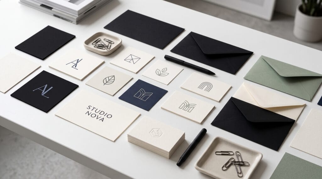
Strong branding does not require complicated graphics. The best minimalist logo design ideas use a small number of carefully chosen elements to create a mark that is clear, memorable, and easy to apply across every customer touchpoint.
Minimalism is often misunderstood as making a logo plain. In professional branding, it means removing anything that does not support recognition, meaning, or usability. Every line, letter, shape, and color must have a purpose.
A successful minimalist logo design should work on a website header, mobile icon, package, social profile, invoice, storefront, and embroidered uniform without losing its identity.
This guide explores practical logo styles, industry examples, typography, color palettes, negative space, layout principles, common mistakes, and a complete process for creating a professional minimalist identity.
Why Minimalist Logo Design Works for Professional Branding
Minimalist identities remain popular because they are flexible.
A simple mark is easier to:
- Recognize
- Reproduce
- Animate
- Resize
- Embroider
- Combine with a broader visual system
Professional minimalist logo design can help a brand:
- Create a clear first impression
- Look confident and established
- Remain readable at small sizes
- Adapt to print and digital formats
- Reduce visual clutter
- Support consistent brand applications
- Age more gracefully than trend-heavy designs
The goal is not to make every company look the same.
The goal is to communicate the brand with the least visual noise possible.
Core Principles of Minimalist Logo Design
A simple-looking logo can require significant strategic and creative work. The following principles help designers avoid creating marks that are clean but forgettable.
Start With One Clear Idea
The strongest logos usually communicate one central idea.
That idea may be:
- The company name
- An initial
- A product function
- A location
- A distinctive brand attribute
- A customer benefit
- A visual metaphor
A logo becomes weaker when it tries to represent every service, value, audience, and company story at once.
For example, a financial advisory company does not need to include money, growth, security, partnership, and global reach inside one symbol. One well-developed idea may communicate the brand more effectively.
Use Simple Geometry
Circles, squares, triangles, lines, and custom geometric forms create structure.
Geometry can communicate:
- Stability
- Movement
- Balance
- Precision
- Connection
- Progress
- Protection
Simple shapes are not automatically generic. Originality comes from proportion, arrangement, custom details, and relevance to the brand.
A circle may become distinctive through an intentional cut, overlapping section, negative-space letter, or unusual relationship with the wordmark.
Prioritize Recognition
A logo should be identifiable before it is decorative.
Test:
- The silhouette
- Spacing
- Primary shape
- Letterform
- Overall balance
Review the mark without color, shadows, gradients, mockups, or texture.
When a logo cannot be recognized in black and white, additional styling is unlikely to solve the underlying problem.
Build With Scalability in Mind
Fine details, thin gaps, and tiny text may disappear at small sizes.
Create the design as a clean vector and test it at:
- Favicon size
- Social media avatar size
- Mobile navigation size
- Business card size
- Packaging size
- Signage size
The simplified version should remain connected to the primary identity.
Use Restraint Consistently
Minimalism should continue through typography, color, spacing, photography, packaging, and layouts.
A simple logo surrounded by an inconsistent brand system will not feel professional.
The same sense of clarity should appear in:
- Website navigation
- Marketing materials
- Social media templates
- Product packaging
- Presentations
- Customer documents
Minimalist Logo Design Ideas for Different Brand Styles
There is no single formula for minimalist branding. Different structures can create very different personalities while remaining simple.
Clean Wordmark
A wordmark uses the company name as the main logo.
It is one of the most effective minimalist approaches because it builds direct name recognition.
Professional wordmarks often rely on:
- Custom spacing
- Modified letters
- Distinctive terminals
- Unusual proportions
- A subtle ligature
- A cropped or extended character
A wordmark works particularly well when the company name is short, memorable, and visually distinctive.
Simple Monogram
A monogram combines one or more initials into a compact symbol.
It is useful for brands with long names or businesses that need a recognizable social icon.
Minimalist monogram ideas include:
- Interlocking initials
- Mirrored letters
- Shared vertical strokes
- Stacked initials
- Initials contained within a geometric frame
- Letters formed through negative space
Keep the initials legible.
Overlapping letters should create a unique form without becoming an unreadable puzzle.
Geometric Symbol
A geometric symbol can represent a product, movement, system, or abstract brand idea.
Common structures include:
- Interlocking circles
- Directional arrows
- Modular squares
- Continuous lines
- Rotated shapes
- Symmetrical forms
The symbol should have a reason to exist beyond looking modern.
A logistics company might use a directional form to suggest movement. A software platform may use connected modules to communicate integration.
Negative-Space Logo
Negative space uses the empty area around or inside shapes to reveal a second symbol, letter, or idea.
This technique can make a logo more memorable, but the hidden element should remain understandable.
A clever concept that nobody notices adds little value.
Useful negative-space ideas include:
- A letter hidden inside an icon
- An arrow formed between shapes
- An object revealed inside a monogram
- Two symbols sharing one outline
- A product silhouette created through empty space
Minimal Line-Art Mark
Line-art logos use a limited number of strokes to create a recognizable image.
They work well for:
- Wellness
- Beauty
- Architecture
- Hospitality
- Creative businesses
- Interior design
- Lifestyle brands
Use consistent stroke weight and avoid details that collapse when the mark is reduced.
Abstract Letterform
An abstract letterform starts with an initial and transforms it through:
- Cropping
- Rotation
- Repetition
- Reflection
- Geometric construction
- Shared shapes
This approach can feel distinctive while remaining connected to the company name.
Symbol and Wordmark Combination
A combination mark pairs a simple icon with a wordmark.
This is often the most practical choice because the brand can use the full logo or the icon separately.
Create:
- A horizontal version
- A stacked version
- A compact version
- An icon-only version
Do not force one arrangement into every format.
Also Read: Minimalist Graphic Design Inspiration for Modern Brands
Professional Minimalist Logo Ideas by Industry
Different industries require different levels of personality, trust, warmth, and visual energy.
Technology and Software
Technology logos often benefit from geometric symbols, modular forms, monograms, and clean sans serif wordmarks.
Useful ideas include:
- Connected nodes simplified into one symbol
- A letter built from modular blocks
- A subtle forward arrow inside the wordmark
- A continuous line representing workflow
- A balanced grid suggesting systems and reliability
- A simple shape that can be animated
Avoid relying entirely on generic circuit lines, globes, or abstract blue icons.
Consulting and Professional Services
Consulting, legal, financial, and advisory brands need clarity and credibility.
Refined wordmarks, letter monograms, and restrained geometric marks usually work well.
Possible directions include:
- A strong serif wordmark
- A monogram inside a square
- A simple symbol representing alignment
- An abstract bridge or connection
- A restrained directional mark
Avoid overly playful symbols unless the company positioning clearly supports them.
Beauty and Wellness
Beauty and wellness brands often use elegant wordmarks, thin line symbols, botanical abstractions, or soft geometric shapes.
Minimalism in this category should still feel distinctive.
Generic leaf icons, faces, and standard script fonts are heavily overused.
A better approach may involve:
- A custom botanical shape
- A refined serif wordmark
- A subtle monogram
- A soft geometric emblem
- A symbol based on the product process
Fashion and Lifestyle
Fashion brands often use:
- Custom wordmarks
- Initials
- Elegant serif typography
- Bold sans serif systems
- Cropped letterforms
- Monochrome symbols
A strong fashion logo can be extremely simple because materials, photography, packaging, and art direction provide additional personality.
Food and Beverage
Restaurants, cafes, and packaged food brands can use simplified:
- Ingredients
- Utensils
- Initials
- Containers
- Location-inspired symbols
- Product silhouettes
The design should remain warm and appetizing rather than becoming clinically minimal.
A cafe logo might use a single curved line to suggest steam, while a bakery could transform an initial into a wheat-inspired symbol.
Architecture and Real Estate
Architectural logos often use:
- Structured grids
- Building silhouettes
- Dimensional initials
- Line-based forms
- Squares and frames
- Carefully balanced wordmarks
Professional results depend on proportion and spacing more than decorative detail.
Creative Studios
Creative businesses can use unexpected cropping, flexible symbols, modular identities, or custom lettering while keeping the overall system simple.
A minimalist identity does not need to be conservative.
It can be bold, experimental, and expressive when the concept remains controlled.
Minimalist Logo Typography for Strong Branding
Typography often carries most of the personality in a minimalist logo.
When illustration is reduced, every letterform becomes more visible.
Sans Serif Typography
Sans serif fonts communicate clarity, modernity, and efficiency.
Geometric sans serifs feel precise and structured, while humanist sans serifs can feel warmer and more approachable.
They work well for:
- Technology brands
- Consulting companies
- Startups
- Architecture firms
- Modern retail
- Professional services
Serif Typography
Serif fonts can create:
- Sophistication
- Authority
- Heritage
- Editorial character
- Premium positioning
Modern high-contrast serifs work well for fashion and beauty, while sturdier serifs suit professional, food, and hospitality brands.
Custom Lettering
Custom lettering helps a simple logo feel original.
Designers can:
- Modify one or two letters
- Create a distinctive ligature
- Adjust terminals
- Change the crossbar
- Crop selected characters
- Build a unique monogram
Custom lettering does not always require creating an entire typeface. Small, intentional modifications can produce a recognizable wordmark.
Typography Details to Review
Evaluate:
- Kerning between letters
- Overall tracking
- Letter width
- Capitalization
- Stroke contrast
- Baseline alignment
- Readability at small sizes
- The relationship between the symbol and wordmark
A standard font can become a strong logo when spacing and letter details are refined carefully.
Also Read: 20+ Typography Logo Ideas That Look Premium and Simple
Minimalist Logo Color Palettes
Minimalist branding often uses a limited palette, but limited does not mean colorless.
The right color system can create recognition and emotional distinction.
Monochrome
Black and white create maximum contrast and flexibility.
A monochrome logo is also an essential production test. When the design only works with a specific gradient or effect, the underlying structure may need improvement.
Navy and Warm White
This combination feels dependable, professional, and less severe than pure black.
It works well for:
- Consulting
- Finance
- Technology
- Property
- Education
- Professional services
Charcoal and Muted Green
Charcoal and soft green can communicate balance, responsibility, and contemporary natural positioning.
This combination is suitable for wellness, sustainability, lifestyle, and environmentally focused brands.
Cream and Deep Burgundy
This palette supports premium:
- Hospitality
- Food
- Fashion
- Editorial branding
- Events
- Boutique retail
The contrast feels warm and sophisticated.
Soft Neutral System
Warm gray, sand, cream, and dark brown create a calm, refined identity.
Use sufficient contrast to protect readability and accessibility.
Minimalist Color Comparison Table
| Palette | Best For | Brand Impression |
|---|---|---|
| Black and white | Creative, fashion, technology | Confident and flexible |
| Navy and warm white | Consulting, finance, property | Trustworthy and established |
| Charcoal and muted green | Wellness, sustainability, lifestyle | Balanced and contemporary |
| Burgundy and cream | Hospitality, food, luxury | Warm and premium |
| Brown and sand | Craft, interiors, natural products | Grounded and refined |
How to Use Negative Space Without Making the Logo Confusing
Negative space can add depth to a minimalist logo design, but it should support recognition rather than become a visual trick.
Keep the Primary Shape Strong
The logo should still work even when a viewer does not immediately notice the hidden element.
The primary silhouette should remain:
- Clear
- Balanced
- Recognizable
- Relevant to the brand
Use One Hidden Idea
Trying to hide several symbols inside one mark usually creates clutter.
One secondary idea is enough.
A delivery logo might combine a box and an arrow. It does not also need to include a road, clock, map pin, and letter.
Test With Unfamiliar Viewers
Show the concept to people who have not seen the design process.
Ask:
- What do you notice first?
- What does the mark represent?
- Can you see the hidden shape?
- Does the symbol feel intentional?
- Does it match the brand?
Designers often see concepts more easily because they understand how the mark was created.
Avoid Fragile Gaps
Small negative spaces may close during:
- Printing
- Engraving
- Embroidery
- Vinyl cutting
- Low-resolution display
Test production sizes early.
A Step-by-Step Minimalist Logo Design Process
A structured process helps transform an attractive visual idea into a usable brand asset.
1. Clarify the Brand Strategy
Define:
- The target audience
- The offer
- The market category
- The positioning
- The brand personality
- The key competitive difference
- The desired customer impression
A logo should translate strategy rather than replace it.
2. Identify the Core Concept
Select one idea worth expressing.
It may be:
- Simplicity
- Speed
- Connection
- Craftsmanship
- Precision
- Care
- Stability
- Progress
- A distinctive aspect of the company name
Write the concept in one sentence before sketching.
3. Research the Category
Review competitors to understand common:
- Symbols
- Colors
- Typography
- Layouts
- Claims
- Visual conventions
The goal is not to copy the category.
The goal is to avoid accidental imitation and identify opportunities for differentiation.
4. Sketch in Black and White
Create many small concepts without relying on color.
Explore:
- Wordmarks
- Monograms
- Symbols
- Negative-space ideas
- Abstract letterforms
- Combination marks
Small sketches help you evaluate the core structure before spending time on details.
5. Reduce the Design
Remove elements one at a time.
When the logo remains clear without a line, shape, word, or detail, that element may not be necessary.
Reduction should strengthen the idea rather than make it anonymous.
6. Refine Typography and Proportions
Adjust:
- Spacing
- Alignment
- Optical balance
- Stroke weight
- Letter proportions
- Symbol scale
- Clear space
- The relationship between the icon and name
Do not rely exclusively on mathematical alignment. Optical adjustments are often required.
7. Build a Flexible Logo System
Create:
- A primary logo
- A horizontal logo
- A stacked logo
- A standalone icon
- A one-color version
- A reversed version
- A small-size version
Each version should feel like part of the same identity.
8. Test Real Applications
Place the logo on:
- A website
- A mobile screen
- A business card
- A social profile
- An invoice
- Packaging
- Signage
- Merchandise
- Email signatures
- Presentation slides
Real applications reveal weaknesses quickly.
9. Prepare Final Files and Guidelines
Export appropriate vector and raster formats.
Document:
- Clear space
- Minimum size
- Color values
- Approved variations
- Background rules
- Incorrect uses
- Typography
- File naming
This makes the identity easier to use consistently.
Minimalist Logo Design Tools
Professional designers commonly use vector software because logos must scale without losing quality.
Useful tool categories include:
- Vector design software for final construction
- Sketching apps for early concepts
- Font management tools
- Color contrast checkers
- Mockup tools for presentation
- AI image tools for concept exploration
AI can help generate directions, symbols, and mood boards, but final logos still require:
- Original thinking
- Typography correction
- Vector refinement
- Scalability testing
- Production preparation
- Originality and trademark checks
Common Minimalist Logo Design Mistakes
1. Removing Too Much Personality
A logo can become so neutral that it looks interchangeable with competitors.
Simplicity should reveal the brand, not erase it.
2. Using a Generic Symbol
Common globes, leaves, lightbulbs, mountains, and chat bubbles often need a unique conceptual or formal treatment.
Ask whether the symbol could represent dozens of unrelated companies.
3. Depending on Thin Lines
Extremely thin strokes may fail on:
- Small screens
- Signage
- Embroidery
- Packaging
- Low-quality printing
Prepare a stronger small-size version when necessary.
4. Following Trends Too Closely
Popular gradients, type styles, and geometric effects can date quickly.
Build the identity around brand strategy rather than a temporary aesthetic.
5. Ignoring Typography
A simple icon cannot compensate for poorly spaced or unsuitable lettering.
Typography is often the most visible part of a minimalist identity.
6. Designing Only One Version
A professional identity needs several approved arrangements and production variations.
One horizontal logo cannot solve every application.
7. Skipping Originality Checks
Simple geometric ideas can unintentionally resemble existing marks.
Search the market and obtain appropriate legal guidance before registration or major investment.
Also Read: Logo Redesign Made Simple: A Full Case Study
Minimalist Logo Design Checklist
Use this checklist before approving the final identity:
- The logo communicates one clear idea.
- The mark works in black and white.
- Typography is readable and intentionally spaced.
- The icon remains recognizable at small sizes.
- The logo is distinctive within its category.
- Colors have sufficient contrast.
- The design works without effects or mockups.
- Horizontal and compact versions are available.
- Vector files are prepared.
- Clear-space and minimum-size rules are documented.
- The final concept has been checked for originality.
- The logo works across print and digital applications.
Frequently Asked Questions
1. What Makes a Logo Minimalist?
A minimalist logo uses only the elements needed for recognition and meaning.
It usually relies on:
- Simple forms
- Controlled typography
- Limited color
- Generous spacing
- A focused concept
Minimalist does not mean unfinished or generic.
2. Is Minimalist Logo Design Suitable for Every Business?
Minimalism can work for many industries, but the degree of simplicity should match the brand personality.
A children’s brand, restaurant, or entertainment company may need more warmth or expression than a consulting firm.
3. How Many Colors Should a Minimalist Logo Use?
One to three colors are usually enough.
The logo should also work in one color for practical production.
4. Which Fonts Work Best for Minimalist Logos?
Clean sans serifs, refined serifs, and custom letterforms are common choices.
The best font is the one that matches the brand and remains distinctive after spacing and customization.
5. Can a Minimalist Logo Include an Illustration?
Yes.
The illustration should be simplified into a clear symbol or line-based mark that remains recognizable at small sizes.
6. How Do I Make a Simple Logo Look Unique?
Use:
- A strong concept
- Custom proportions
- Refined typography
- Meaningful negative space
- Distinctive spacing
- Details connected to the brand
Do not rely on extra decoration to create originality.
7. Should a Minimalist Logo Use a Gradient?
It can, but the logo should not depend on the gradient.
Prepare a flat-color and one-color version for applications where gradients are unavailable or unsuitable.
Conclusion
Professional minimalist logo design is the result of careful decisions, not the absence of design.
A strong identity removes distractions while preserving:
- Personality
- Meaning
- Recognition
- Flexibility
- Usability
Begin with strategy, explore one clear concept, refine the typography, test the mark in black and white, and build a flexible logo system.
The most successful minimalist logos feel simple because every unnecessary element has been removed, not because the thinking behind them was easy.
Also Read: “What Is Branding? A Complete Beginner’s Guide“