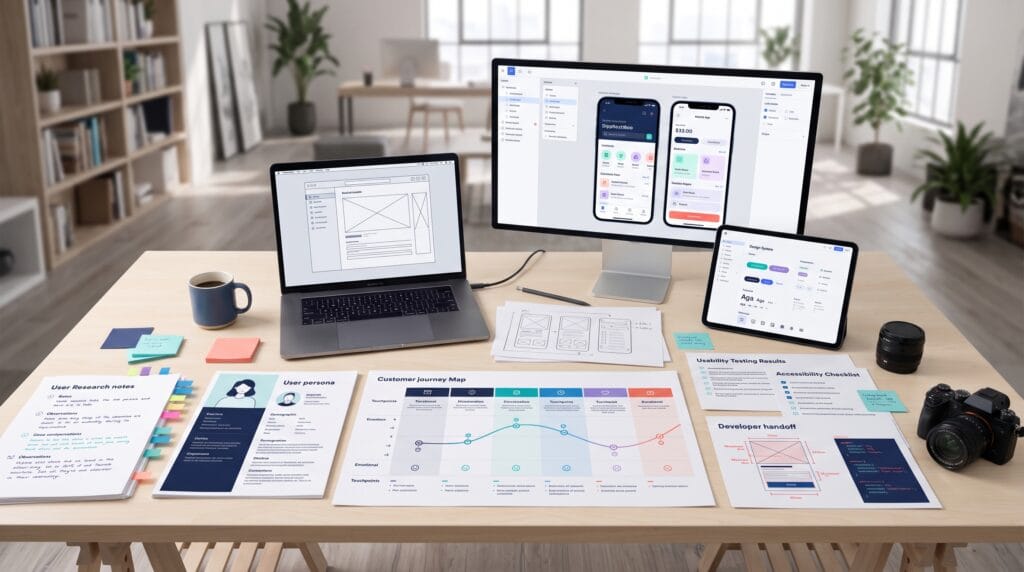
A practical UI/UX tutorial should teach more than how to make attractive screens. Great digital experiences begin with understanding users, defining the right problem, organizing information clearly, testing ideas early, and refining the product through evidence.
UI and UX are closely connected, but they solve different parts of the design challenge. User interface design focuses on visual and interactive elements such as typography, color, buttons, spacing, icons, and states. User experience design focuses on the complete journey, including goals, expectations, navigation, clarity, accessibility, and satisfaction.
This step-by-step UI/UX tutorial explains how to move from an initial product idea to a tested interface. It covers research, personas, journey maps, information architecture, user flows, wireframes, visual hierarchy, responsive design, accessibility, prototyping, usability testing, design systems, and developer handoff.
What Makes a Better User Experience?
A better user experience helps people complete an important task with minimal confusion, unnecessary effort, or risk. It should feel predictable enough to learn quickly and flexible enough to support different needs.
Strong user experiences are usually:
- Useful because they solve a genuine problem
- Usable because actions are easy to understand
- Accessible to people with different abilities
- Consistent across screens and devices
- Efficient for frequent tasks
- Trustworthy with clear feedback and transparent choices
- Responsive to errors, loading, and changing conditions
Good UX Is Not Invisible by Accident
Simple experiences often require significant research, prioritization, testing, and iteration. Removing friction is a deliberate design outcome.
1. Define the Product Goal
Before opening a design tool, clarify what the product should help users achieve and how that outcome supports the organization.
Write a Problem Statement
A useful problem statement identifies the audience, the challenge, the context, and the impact.
Example: Busy freelance designers need a faster way to track project approvals because feedback is currently scattered across email, chat, and documents.
Define Success Metrics
- Task completion rate
- Time required to complete a task
- Activation rate
- Conversion rate
- Error rate
- Customer satisfaction
- Retention
- Support requests
Metrics keep the design process connected to behavior rather than personal taste.
2. Conduct UX Research
Research reduces assumptions. It helps designers understand what users are trying to accomplish, how they behave today, and where frustration occurs.
Choose the Right Research Method
| Method | Best Use | Typical Output |
|---|---|---|
| User interviews | Goals, motivation, and pain points | Themes and quotations |
| Surveys | Patterns across a larger audience | Quantitative responses |
| Observation | Real behavior and workarounds | Contextual insights |
| Analytics | Existing product behavior | Funnels and drop-off points |
| Usability testing | Testing task performance | Issues and severity |
| Competitive review | Understanding alternatives | Feature and experience patterns |
Ask Open Questions
Instead of asking whether users like a proposed feature, ask them to describe the last time they completed the task, what made it difficult, and how they solved the problem.
The uploaded website design resource recommends combining interviews, surveys, observation, analytics, journey analysis, card sorting, tree testing, and usability testing according to the research question.
Also Read: UX Research 2026: What Startups Must Do Now
3. Create Useful Personas
A persona summarizes relevant patterns found in research. It should not be a fictional profile based only on demographic assumptions.
Include Information That Changes Design Decisions
- Primary goals
- Important tasks
- Current tools
- Behavior patterns
- Constraints
- Accessibility needs
- Common frustrations
- Decision criteria
Keep the number of personas limited. One primary persona and one or two secondary personas are often easier to use than a large collection.
4. Map the User Journey
A journey map shows the stages a user moves through before, during, and after using a product.
Common Journey Map Elements
- Stage
- User goal
- Action
- Touchpoint
- Question
- Emotion
- Pain point
- Opportunity
Journey mapping helps teams see where the experience begins before the interface and continues after a transaction or task is completed.
5. Build the Information Architecture
Information architecture organizes content and functions so users can find what they need.
Create a Content Inventory
List pages, screens, features, documents, data, and actions. Remove duplicates and identify missing information.
Group Content Logically
Use customer language rather than internal department names. Card sorting can reveal how users expect information to be grouped.
Design Clear Navigation
- Use familiar labels
- Keep hierarchy shallow when possible
- Show the current location
- Provide predictable back paths
- Prioritize high-frequency destinations
- Support search when content is extensive
6. Create User Flows
A user flow maps the steps required to complete a goal. It includes decisions, system responses, errors, and alternate paths.
Start with One Primary Task
Examples include creating an account, booking an appointment, purchasing a product, uploading a file, or inviting a teammate.
Map the Happy Path and Exceptions
- What happens when information is missing?
- What happens when payment fails?
- Can the user go back without losing progress?
- What if permission is denied?
- What if the connection is interrupted?
- How does the user recover from an error?
A strong UI/UX tutorial treats recovery paths as part of the core experience rather than an afterthought.
7. Sketch Low-Fidelity Ideas
Low-fidelity sketches allow teams to explore several layouts without becoming attached to visual details.
Focus on Structure
- Content priority
- Primary action
- Navigation
- Grouping
- Sequence
- Feedback
- Error recovery
Paper sketches, whiteboards, FigJam, and simple frames are enough at this stage.
8. Build Wireframes
Wireframes translate flows into screen structure. They show where content, navigation, controls, and actions belong.
Wireframe Best Practices
- Use realistic content lengths
- Show loading and empty states
- Include errors and validation
- Design mobile and desktop structures
- Keep one clear primary action per screen
- Use consistent spacing
- Annotate unusual behavior
Do not use polished colors and imagery too early. The purpose is to test comprehension and flow.
9. Establish Visual Hierarchy
Visual hierarchy directs attention toward the most important information and action.
Use Size, Weight, and Position
Headlines, labels, supporting text, and calls to action should have distinct roles. Important elements should be noticeable without making every element loud.
Use White Space
Spacing separates groups, improves scanning, and reduces cognitive load. Empty space is a functional part of the layout.
Limit Competing Actions
Too many prominent buttons create decision friction. Use one primary action, appropriate secondary actions, and lower-emphasis text links.
10. Design Typography for Readability
Typography affects comprehension, tone, hierarchy, and accessibility.
Create a Type Scale
- Display or page title
- Section heading
- Subheading
- Body text
- Label
- Caption
- Button text
Control Line Length and Spacing
Body text should remain comfortable to scan. Avoid long lines, compressed line spacing, excessive center alignment, and very small text.
11. Build a Functional Color System
A product color system should support hierarchy, branding, status, contrast, and interaction.
Define Color Roles
- Primary action
- Secondary action
- Background
- Surface
- Body text
- Muted text
- Border
- Success
- Warning
- Error
- Information
Do not rely on color alone to communicate meaning. Pair status colors with text, icons, or patterns.
12. Design Components and States
Components are reusable interface elements such as buttons, inputs, cards, tabs, navigation, and alerts.
Design Every State
| Component | States to Consider |
|---|---|
| Button | Default, hover, focus, pressed, disabled, loading |
| Input | Empty, active, filled, valid, error, disabled |
| Card | Default, selected, expanded, unavailable |
| Notification | Information, success, warning, error |
| Data view | Loading, empty, partial, error, complete |
The uploaded resource emphasizes visual and functional consistency across typography, colors, navigation, buttons, forms, devices, feedback, and accessibility.
13. Apply UX Writing
Interface words guide decisions. Buttons, labels, instructions, empty states, confirmations, and errors should be concise and specific.
Write Action-Oriented Labels
Use “Create project,” “Save changes,” or “Send invitation” instead of vague labels such as “Continue” when the exact action matters.
Write Helpful Error Messages
An error message should explain what happened, why it matters, and what the user can do next.
Use a Consistent Voice
The product may sound friendly, professional, calm, or energetic, but clarity should remain the priority.
Also Read: UX Writing Guide for Better Labels, CTAs, and Navigation
14. Design for Accessibility
Accessible design allows more people to perceive, understand, navigate, and operate the interface.
Accessibility Checklist
- Use sufficient color contrast
- Support keyboard navigation
- Show visible focus states
- Use clear form labels
- Provide meaningful image alternatives
- Do not rely on color alone
- Allow text resizing
- Use large touch targets
- Provide captions and transcripts
- Respect reduced-motion preferences
Accessibility should be tested throughout the process rather than added at the end.
15. Create Responsive Layouts
Responsive design adapts content and interactions across screen sizes.
Prioritize Content, Not Devices
Ask which content and actions must remain visible when space becomes limited. Reflow, stack, simplify, or progressively disclose less important elements.
Test Real Content
Long names, translated labels, error messages, and large datasets can reveal layout failures that placeholder text hides.
16. Build an Interactive Prototype
A prototype connects screens so teams can experience the flow before development.
Choose the Right Fidelity
- Low fidelity for flow and structure
- Medium fidelity for layout and interaction
- High fidelity for visual detail and realistic testing
Figma, ProtoPie, Framer, and similar tools support different levels of interaction. Use the lightest prototype that can answer the current question.
17. Conduct Usability Testing
Usability testing shows where users hesitate, misunderstand, backtrack, fail, or create workarounds.
Create Realistic Tasks
Ask participants to complete a goal without explaining the interface. Avoid leading language that contains the answer.
Observe Behavior
- Where does the participant pause?
- What do they expect to happen?
- Which labels are unclear?
- Where do they go first?
- Can they recover from errors?
- Do they complete the task?
Prioritize Findings
Rate issues by frequency, severity, impact, and implementation effort. Fix critical task failures before polishing minor visual details.
18. Iterate with Evidence
A design should change because research, testing, analytics, accessibility review, or technical constraints reveal a better solution.
Keep a Decision Log
Record the issue, evidence, design change, expected result, and final outcome. This prevents teams from repeating debates and helps new members understand the product.
19. Build a Design System
A design system combines principles, reusable components, tokens, patterns, and documentation.
Core Design System Elements
- Color tokens
- Typography styles
- Spacing scale
- Grid rules
- Icons
- Buttons
- Form controls
- Navigation patterns
- Feedback patterns
- Accessibility guidance
- Content standards
A design system improves consistency, reduces design debt, and makes collaboration with developers faster.
20. Prepare Developer Handoff
Handoff is a collaborative process, not a single file delivery.
Include Complete Specifications
- Responsive behavior
- Component states
- Spacing and sizing
- Content rules
- Interaction details
- Accessibility requirements
- Loading, empty, and error states
- Assets and export settings
- Analytics events
Review the Built Experience
Design quality assurance should compare the implemented product with the intended behavior across browsers, devices, screen sizes, and assistive technologies.
Also Read: UI UX Design Process for Faster Feedback and Better UX
UI/UX Tools for Each Stage
| Stage | Tool Types | Examples |
|---|---|---|
| Research | Interviews, surveys, testing | Maze, UserTesting, Lookback |
| Mapping | Whiteboards and diagrams | FigJam, Miro, Whimsical |
| Wireframes | Interface design | Figma, Sketch |
| Prototyping | Clickable and advanced interactions | Figma, ProtoPie, Framer |
| Design systems | Components and documentation | Figma, Storybook, Zeroheight |
| Analytics | Behavior and product data | Google Analytics, Mixpanel, Hotjar |
| Handoff | Specifications and development | Figma Dev Mode, Storybook |
A Simple UI/UX Project Workflow
- Define the user and business problem.
- Choose measurable outcomes.
- Conduct focused research.
- Create personas and journey maps.
- Organize information.
- Map primary and alternate user flows.
- Sketch several solutions.
- Build low-fidelity wireframes.
- Create visual hierarchy and components.
- Apply accessibility and responsive rules.
- Prototype the key journey.
- Test with representative users.
- Prioritize and fix important issues.
- Document patterns in a design system.
- Collaborate through development and QA.
- Measure behavior after launch.
Common UI/UX Design Mistakes
1. Starting with Visual Trends
A fashionable interface cannot compensate for an unclear problem or broken workflow.
2. Designing Only the Happy Path
Real products need loading, empty, permission, offline, error, and recovery states.
3. Using Placeholder Content
Unrealistic content lengths can hide problems with hierarchy, spacing, translation, and data density.
4. Testing Too Late
Early testing is cheaper because structural changes are easier before development.
5. Ignoring Accessibility
Accessibility problems can exclude users and often reveal broader usability weaknesses.
6. Treating Handoff as the End
Designers should remain involved during implementation and measure the experience after release.
UI/UX Tutorial Checklist
- Define the user problem
- Set measurable outcomes
- Research real behavior
- Create focused personas
- Map the user journey
- Build the information architecture
- Design primary and alternate flows
- Create wireframes
- Establish visual hierarchy
- Build accessible typography and color systems
- Design reusable components and states
- Write clear interface copy
- Create responsive layouts
- Prototype important journeys
- Test with representative users
- Prioritize findings
- Document the design system
- Prepare complete handoff specifications
- Review implementation
- Measure post-launch performance
Frequently Asked Questions
1. What is the difference between UI and UX design?
UI design focuses on the visual and interactive interface. UX design focuses on the complete experience, including research, structure, flow, usability, accessibility, and satisfaction.
2. Which tool is best for learning UI/UX design?
Figma is a common starting point because it supports wireframes, interface design, components, prototypes, collaboration, and handoff. Research and testing skills remain more important than any single tool.
3. Do UI/UX designers need to code?
Coding is not always required, but understanding HTML, CSS, responsive behavior, components, and technical constraints improves collaboration and feasibility.
4. How long does a UI/UX project take?
The timeline depends on product complexity, research needs, team size, and testing. A focused feature may take days or weeks, while a complete product can require months of iterative work.
5. How do designers know whether UX is improving?
Track task completion, time on task, errors, activation, conversion, retention, support requests, and satisfaction. Combine behavioral metrics with qualitative research.
Conclusion on UI/UX Tutorial
A strong UI/UX tutorial begins with people, not pixels. Research reveals the real problem, flows organize the journey, wireframes test structure, interface design creates clarity, and usability testing shows what needs to improve.
Use this process repeatedly rather than treating design as a one-time phase. The best user experiences emerge when designers, researchers, writers, developers, and product leaders collaborate, test assumptions, and refine the product with evidence.
Also Read: “Figma Tutorial: Learn UI/UX Design Like a Professional“